Website Redesign - Reportera
Hello guys, for this redesign I focused on finding ways to make the live website more aethetic and modern using the fundamental elements of design.
Problems
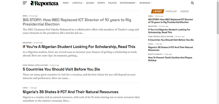
Too many font families were used, showing a lack of consistency.
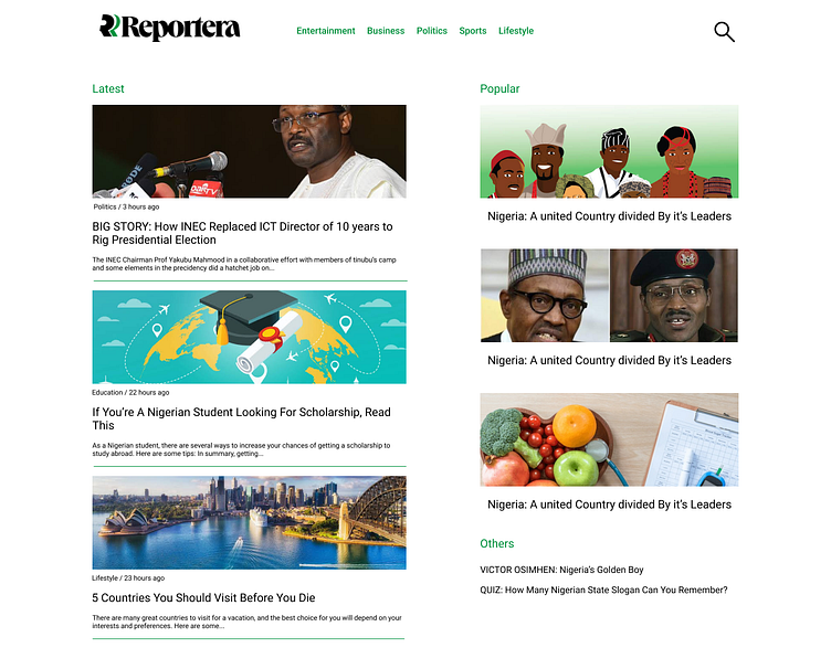
For a news website, relevant pictures are lacking.
Navigation is cluttered.
Columns are repeated unnecessarily.
Brand color isn't maintained.

Solutions
I used a consistent font, Roboto, throughout the design.
Pictures relevant to the articles were added to the design.
Navigation was rethought; categories were simplified.
Three main sections were created; Latest, popular, and others.
The stand out brand color is green, so it is used for thin lines, categories, and navigation.
Summary
The live website is very simple, and I assume it's very intentional so in my design I made sure to maintain that.
That said, I included simple design principles aimed at making the website more consistent, vibrant and alive.
Thanks for learning with me!
Want to see more or do some work together? Send a quick mail to sobiora1@gmail.com.
