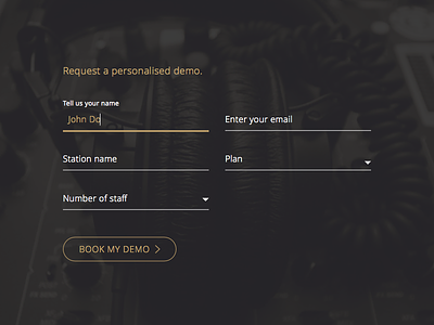
Floating Labels - Request a Demo
This is a form that I designed for the Radio.co Gold page. In order to make it look more expensive, I didn't settle with simple boxes for inputs, I decided to use floating labels. Floating labels are not only visually more appealing but they also add to good user experience because the user is always aware of what is being asked. They take up less space than conventional left aligned labels.
More by Roberts Ozolins View profile
Like

