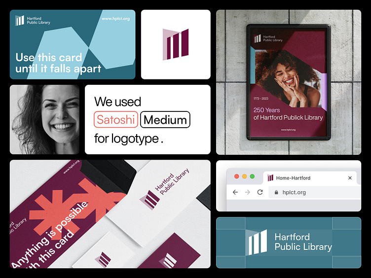
Hartford Public Library - concept design
The rebranded logo embodies the Hartford Public Library's commitment to knowledge and understanding. The design features a window in perspective that symbolizes the library's vision to be a "Window to knowledge and understanding of the world."
It represents the library's dedication to constantly evolving and adapting to the ever-changing modern world.
The open window acts as a portal to books and knowledge, encouraging curiosity and inviting users to explore the library's resources.
The refreshed color palette has burgundy as its dominant color, conveying a sense of nobility and charm.
A touch of teal blue and purple shades conveys an essence of growth, renewal, and creativity, a perfect match for the Hartford Library's branding.
These color combinations create a visually appealing and emotionally engaging color palette that is rich and dynamic.
Like and comment if you liked our design, or email us at ✉️ friends@flexy.global!


