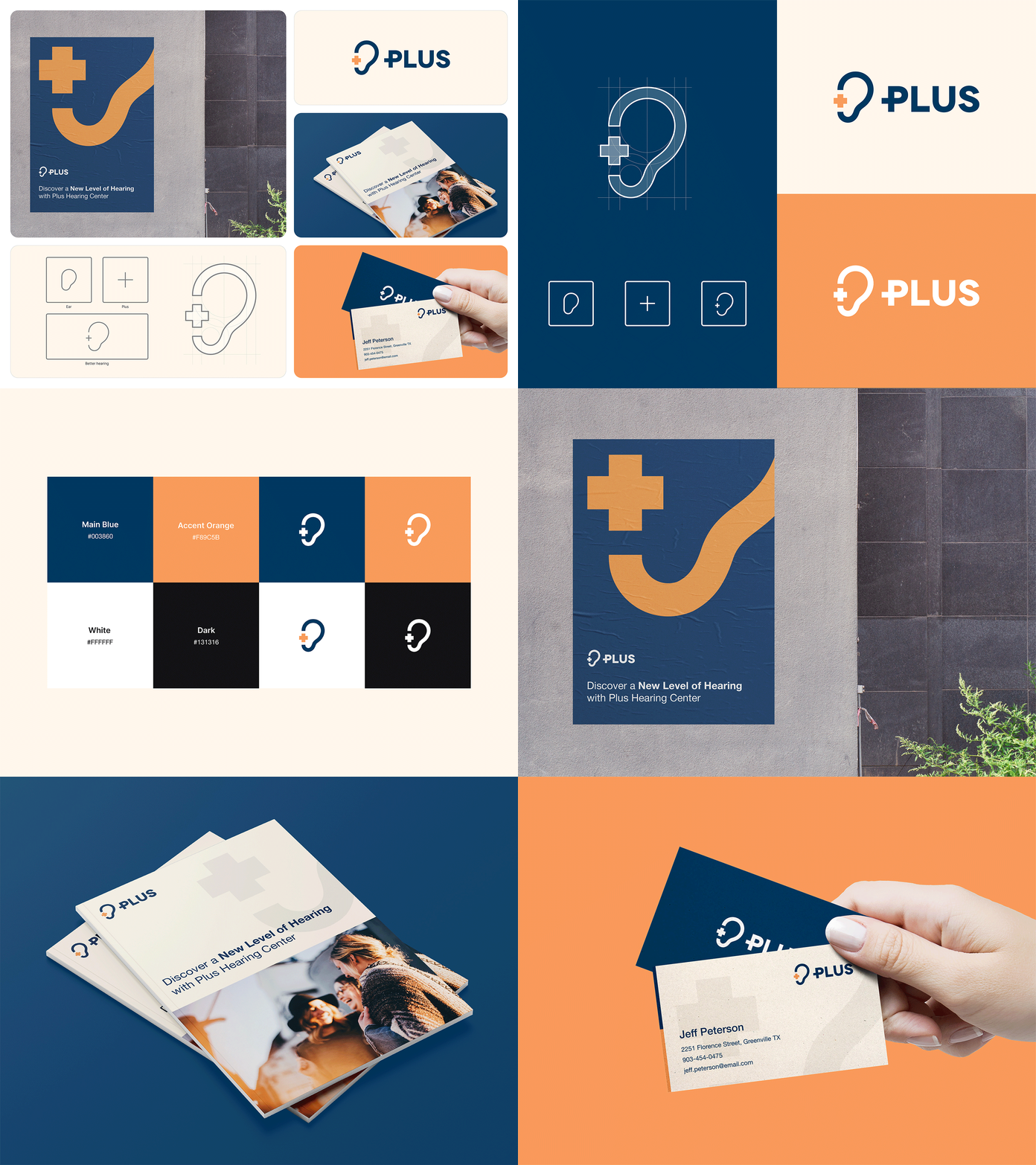
Plus Hearing Center
Client: Plus Hearing Center
Services: Visual identity
Year: 2017 // Redesign: 2023
Design: Sanjin Halilovic
The company "Plus d.o.o." was founded in 2001 as an authorized Siemens hearing center for Bosnia and Herzegovina. In 2008, the Swiss brand Phonak hearing aids joined our offer, thus completing our range with the leading brands of hearing aids in the world. In 2010, the company Siemens added the premium brand Signia to its department for audiological solutions, and since 2017, only the name Signia has been used for the now former Siemens hearing aids.
Concept
Logo concept is feature a stylized ear design in a bold, graphic style with a plus sign incorporated within the ear's shape. The color scheme is kept minimalistic with shades of blue and orange, indicating a sense of calm and trustworthiness. The company name is be written beside the symbol in a clean and modern font.
This logo concept is create a strong and memorable visual identity for this hearing center.


