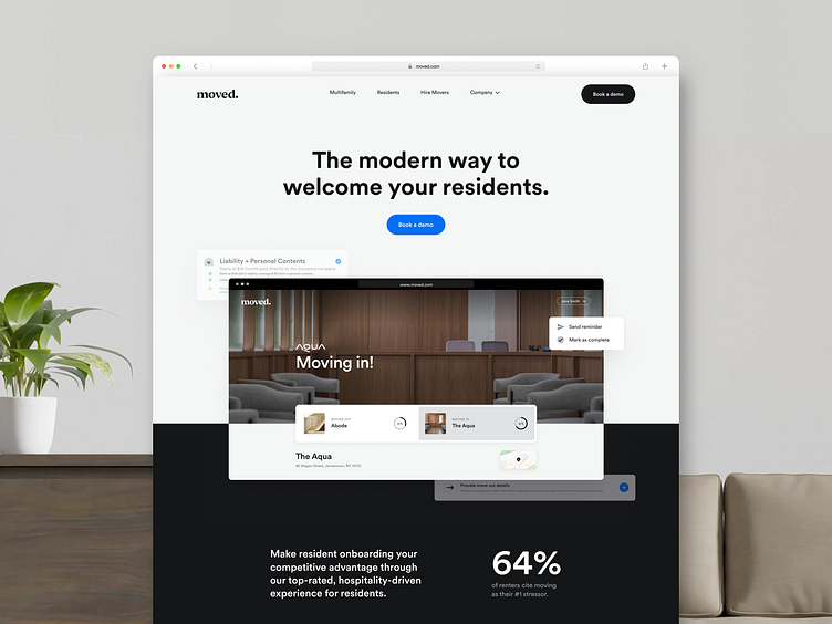
Moved case study 1: Website design for a resident platform
Client
Moved is a revolutionary resident onboarding platform. They are changing the game by making it possible for on-site teams to spend less time doing paperwork and more time interacting with their residents.
The platform creates a seamless digital move-in experience for residents while giving the tools properties need to make more money, save time, and build stronger communities.
It provides thoughtful ancillary revenue opportunities through an online marketplace, task management, property-branded experience, deep integrations, and more for multifamily properties.
Project goal
The company provides software + service (moving) and needs to make multifamily software more the forefront of the business.
The client wants to refresh and showcase the product to show software-first business. The main task for our team was to create a website consistent with the existing brand style and design system.
We covered the following set of tasks:
- Research the main style of the website
- Design and develop a business-oriented website
So we will show you the website's main page in today's case study.
Home Page
The home page is the business card and the central page of the entire website.
It should demonstrate the main idea of the platform, tell about the functions, and convey the importance and uniqueness of the product to the user.
Therefore, the main design solution was a combination of screenshots of the product interface and photos. This helped to convey the mood and values of the company, as well as to make the user experience of using the site more friendly.
In the "How it works" section, we added animations with interface elements to improve product understanding and increase user engagement.
In order not to distract the user from the platform interface, the main palette is made in balanced and restrained colors.
Communication with the user is easy and intuitive thanks to complementary design solutions.


