SESA
SESA is a company that provides quality sustainable energy solutions, guaranteeing the safety of people and facilities, ensuring the integrity of the environment. Our work was developed a visual identity that conveyed the sense of environmental responsibility and clean energy for a corporate sector.
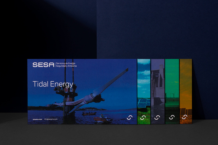
The graphic line remains sober in order to communicate corporate values, using a logo with custom typography, and an isotype created from the two “S” in the name, forming a figure that evokes a cycle, related to renewable energy.
The color palette conveys a much younger feeling, creating a mix between a consolidated company with a young touch. In addition, each color is assigned to a different type of energy.
