Creating Swift, A Design System
This case study documents the process of creating Swift: a design system in support of the digital products of Shuddle, an interplanetary travel company.
The Details
Project Brief
As the Head of Digital for the newly launched IPTS: The Interplanetary Travel Syndicate, you have been tasked with creating 3 unique offerings:
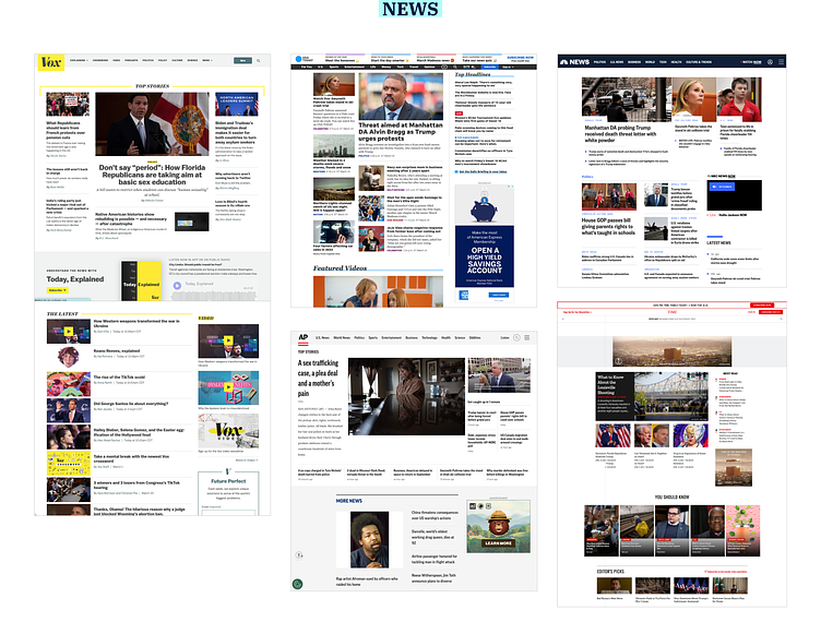
ipts.org: an informational website containing the latest IPTS news and happenings
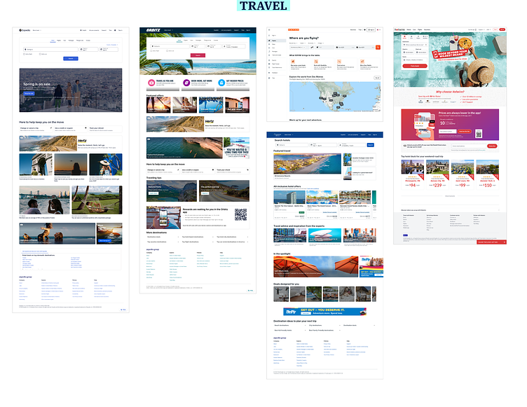
IPTS Travel: a site enabling browsing and bookings to destinations within our galaxy
IPTS Rail: a real-time web app where you can view lines, routes, and times for various commuter lines
You have been provided IPTS' logo, but no other brand assets.
My Role
As the sole designer on the project, I knew that efficiency was going to be paramount. Although not specifically requested as a part of the design deliverables, making a design system in tandem with the 3 products would provide a great foundation on which to scale quickly.
The Process
Research
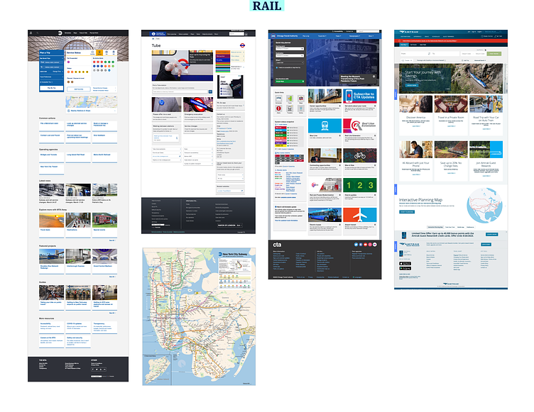
As with any design process I needed to start with research. In order to more deeply understand IPTS' needs, I wanted to take a look at similar sites to observe patterns in content, structure, and visual style. I gathered samples from news sites, travel booking sites, and rail sites and began to observe trends & commonalities to explore in the wireframing stage.
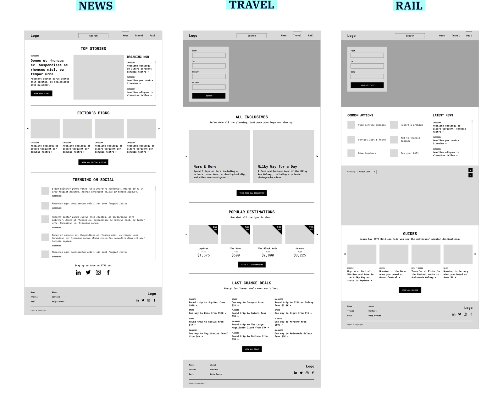
Wireframes
After completing my research, I had a solid idea of what content I wanted to use on each site and ideas for how it could be displayed. In the process of creating my wireframes, I was also considering the common elements of each to eventually be contributed to the design system as indicated by the color coding in the visual below.
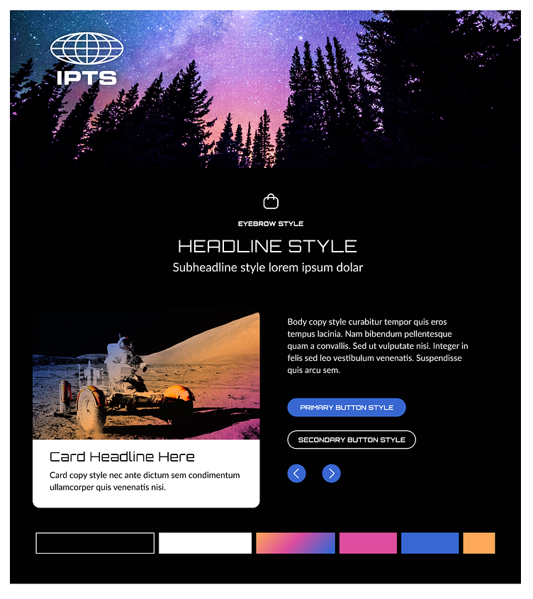
Style Exploration
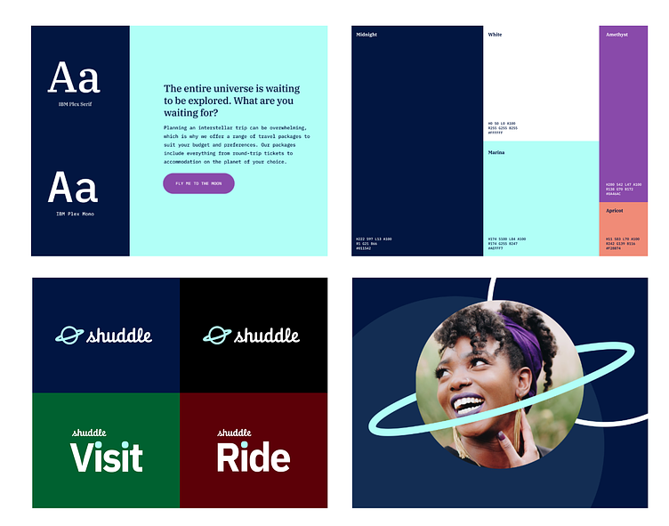
Before I could proceed to the design phase, I needed to establish some styles for color, typography, interactive elements, and photography. After exploring many combinations, I landed on a style with typography that mimics the IPTS logo, and colors and photos that aim to generate excitement around the vast new world of interplanetary travel.
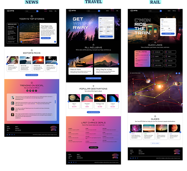
Design
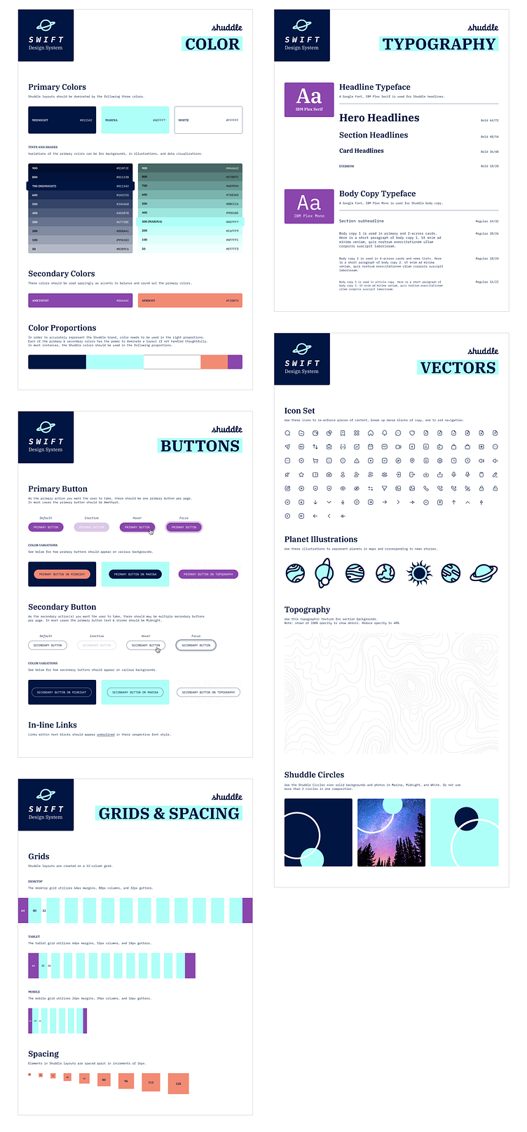
With structure, content, and style now clearly defined, I began designing each of the three products. From the very start, I created styles in Figma for typography and color. Once I was confident that the common components I identified in the wireframe stage were working in context, I created master components with variants for:
Headers
Section headlines
Buttons
News / deals list
Cards
Footers
The Curveball
IPTS Rebrand
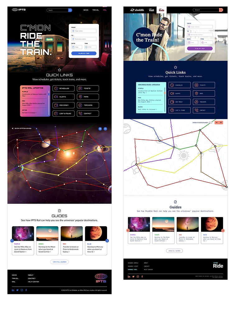
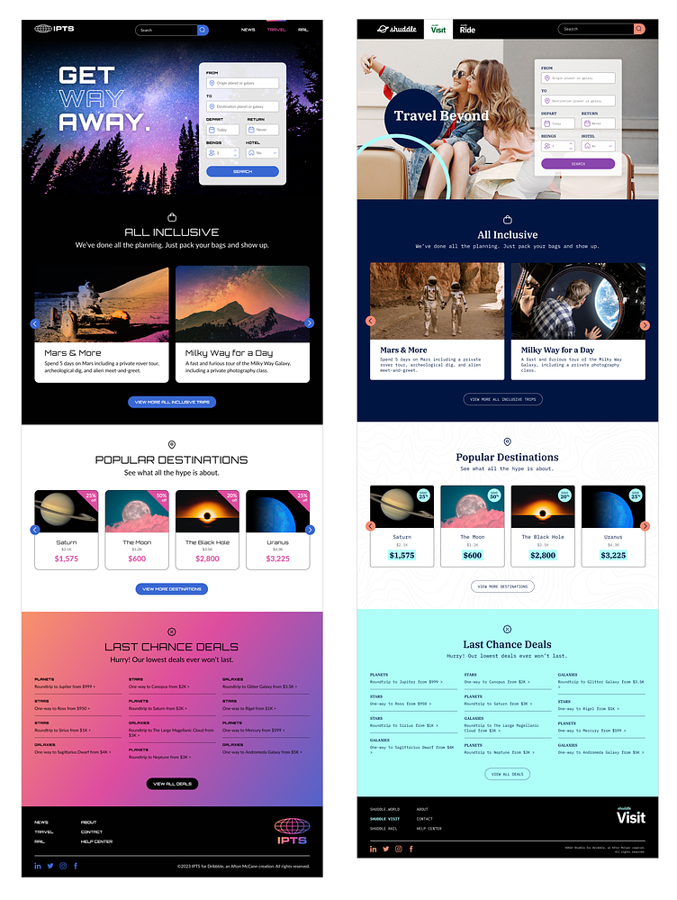
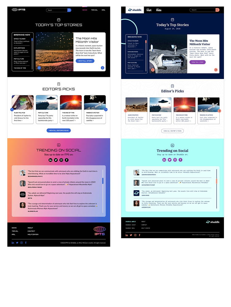
As designers, we all know that curveballs are just part of the process sometimes. Shortly after completing initial design of the 3 products, I found out the IPTS is now Shuddle, complete with new logos, colors, and brand assets–and everything will need to be updated per the new brand.
Now What?
Thankfully, because I had already established styles in Figma and created components for many elements of the design, rebranding the products was relatively straightforward. I updated my fonts and colors, which already had my designs feeling more "Shuddle." However, the atmospheric, futuristic photos I had initially chosen for IPTS did not translate well into the Shuddle rebrand. Because Shuddle's look & feel is focused on the human element of travel, it was important to chose new images depicting people to truly align with the rebrand.
The Outcome
Swift!
As a debt of gratitude to the design system that saved me hours of tedious work manually updating everything, I decided to name Shuddle's design system Swift. The before and after visuals below illustrate how powerful design systems can be not only in creating consistency and efficiency, but also as a tool for quick pivoting with inevitable design curveballs.
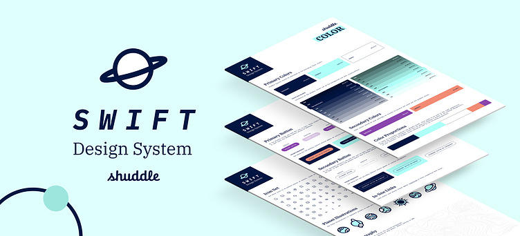
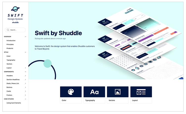
Documentation
No design system is complete without comprehensive documentation, which I completed using zeroheight. A central source of truth for all things Shuddle design, version 1.0 of my documentation site contains guidance on the design atoms and molecules that compose Swift including things like general principles, color, typography, iconography, as well as component documentation and case studies outlining how to use the system.
What's Next?
Testing
In order to make Swift as valuable as possible for users, observing designers using the system and noting pain points to resolve in future releases would be a critical next step.
Version 2.0 & Beyond
As a constantly evolving system, Version 1.0 is square one. Version 2.0 would include the following:
For all components:
Usage guidelines & examples
Detailed specs
Code documentation
Photography guidelines
Additional variations for the Cards component (2 and 3-across)
Prototypes of Shuddle products
Additional case studies on utilizing Swift
As Shuddle products grow and mature, identifying commonalities to contribute back into the system for others to use should become inherent in our design process–the virtuous cycle!