Block 8 Logo / Identity
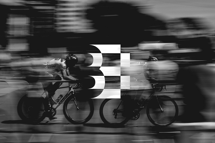
Concept for a manufacturer and distributor of custom cycling apparel.The mark of the brand is designed to be a B and an 8 interchangeably and simultaneously, with emphasis on its strategic use of negative space. The mark also brings reference to a finish line and race flag with its checkered construction, composed of “blocks” itself. In addition, the brand letterforms are condensed in a fashion that resembles the position of a cyclist in motion.The name “Block Eight”, aside from its apparent relation with urban spaces, draws on two primary connections to cycling. The first is to “blocking”, which is a race strategy that is often used by riders in order to put their team at an advantage. Just as blocking provides a clear edge in the sport, Block Eight exists to put cyclists ahead of their competitors with premium quality and innovative design. The second connection is to “block training” which is the primary method of training utilized in cycling. This process is often finished with a recovery week, or rather a “block” of just eight hours of training.


