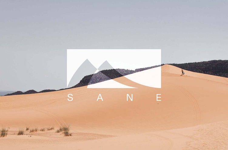
Sane Logo / Identity
Labeling for a clothing company that is committed to helping people find serenity in the great outdoors.The logomark is representative of a formation of mountains. The forms are smooth, drawn out, yet sharp- all of which convey the picture of the company’s desired effect of nature on the minds of individuals- a break from the busy and a restoration to complete sanity. The mark’s positive space (the middle and smaller mountain connecting to the sky) is representative of the human connections to nature and to something greater than oneself.
More by Mark Fisk View profile
Like

