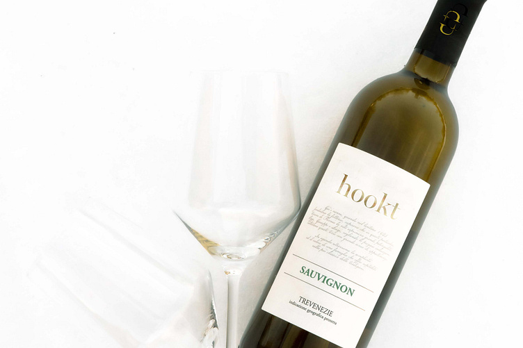
Hookt Identity
Label concept for a wine making company that is dedicated to being part of the solution to substance abuse in the US. The logo mark consists of two hooks that are placed symmetrically to create the appearance of a cycle (representing addiction) that is broken off by both the negative space and the abrupt stop on the side of the alternative hook. Additionally, the design of the mark and type caters to the delicacy and quality that pervades the industry.
More by Mark Fisk View profile
Like

