Case Study: Brand Identity & Pricing Page

Problem
Nearly 34% of women haven't started investing yet compared with 24% of men. Women are more likely to save their money rather than investing it. How might we build a brand and platform to empower women to invest?
Goal
Create a concept brand identity and pricing page for a wealth management service for women.
My Role
Brand Identity
Logo Design
Product/Web Design
Copywriting
Client
Personal project
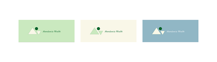
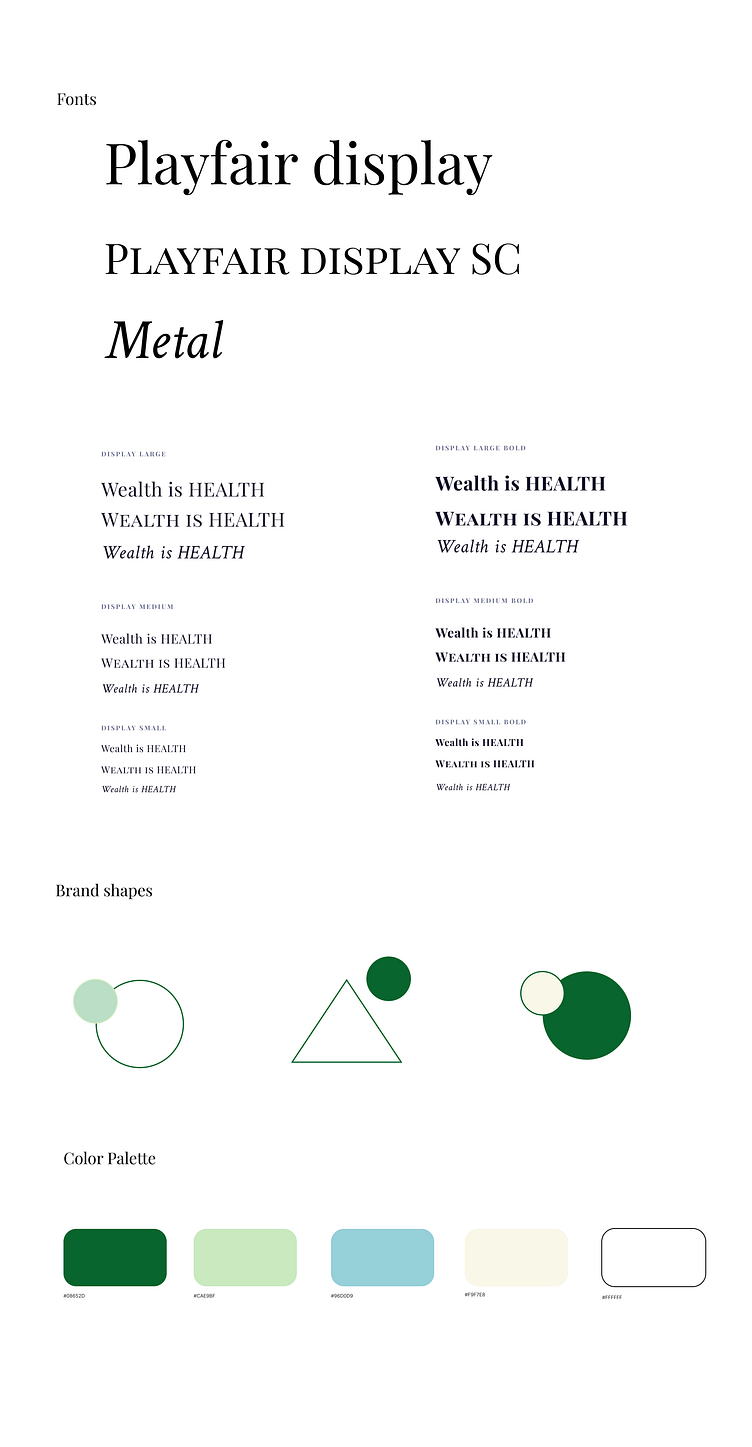
Logo
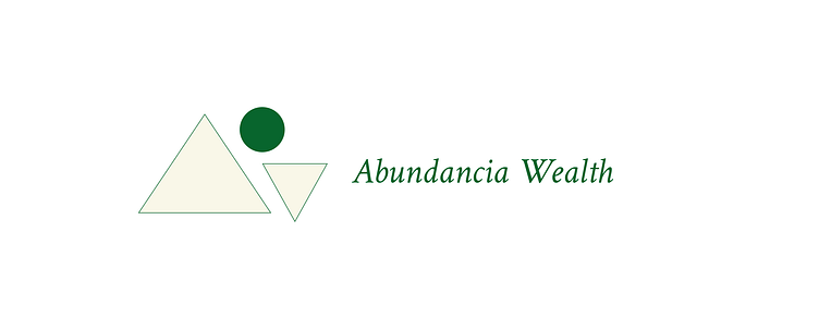
The logomark is composed of two triangles and one circle. The triangles represent strength, stability, and power. The circle, balanced between the two triangles, represents balance, unity, and wholeness.
Abundancia (noun) - Spanish for ABUNDANCE, an ample quantity, to have more than you need.
The name Abundancia Wealth is inspired by the feeling of abundance. We want customers to feel that they are growing in abundance when they are using our wealth management services.
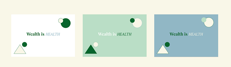
A holistic view of health includes not only our physical health, but our financial health as well.
The slogan Wealth is Health suggests that taking care of our finances is not only beneficial for our wallets, but it is beneficial to our overall health and wellbeing.
Instagram Reel

