Checkout Page
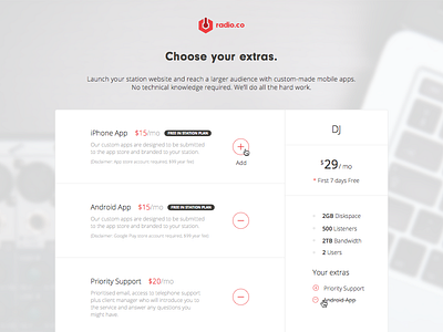
This is a checkout page I designed for Radio.co. The requirement was to design a checkout process with a three step structure.
- Personal / Station Information;
- Add-ons;
- Payment;
- Add another account page (for existing users).
Following brand guidelines, I designed a two column layout. The left side is for user inputs and choices, the right side works as a listed summary including the total price that updates dynamically based on selected extras. If users have picked their extras and changed their mind on the payment section, they don't have to go backwards to change anything as the summery is always visible and editable.
If an existing user goes through the pricing page to add another radio station/account, their profile would be detected automatically and therefore would eliminate the need for resubmitting personal information. Overall my aim was to make this checkout process easy to understand and navigate. I removed all all of the unnecessary inputs and clustered all of the relevant information in blocks. Visual hierarchy was paramount.


