Drone Solution (Aerologix)
Hi Folks,
Back with one more app Redesign case study!
To shortly introduce the idea behind this case study is that I was looking for some solutions in the drone industry and found this application when I start digging into the app I found a lot of UI/UX-related issues.
Font Replacement: - The font that is used in the recent Aerologix application didn't pass the Il1 test, due to this reason I changed the Font to Nunito Sans.
Color Change: - Recent Color that is used in the Aerologix application didn't meet the vision simulator test, so I changed the blue color to a little darker.
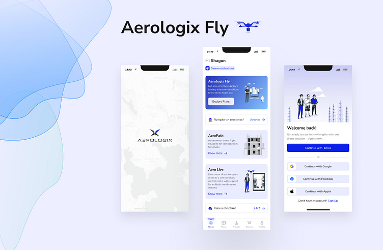
Splash Screen: - Recent Aerologix Fly application splash screen is a bit boring and quite old school, On my solution, I added the headquarters address as a splash screen background and also changed the logo and loader animation.
Country Picker Screen: - In the Recent country picker screen, the use of white space doesn't feel up to the mark, and the search bar is also not very user-friendly and universal, and there is no difference between selected country and others from the list. So, I redesigned the country picker screen from scratch.
Sign-Up Screen: - On Sign-Up, I added an email Input field so that if the user is already registered, he will receive an error message in the early stage and he doesn't have to fill everything and also changed the Sign-Up Form into Sub Screens so that it will not feel like the user is adding too much information.
Forgot Password Screen: - On Recent Forgot Password there is no back to Sign in Button they only have a back button and that is in the top left corner which feels a bit hard to tap with short hands.
Home Screen: - On the Home screen, I added one notification icon bar so that the user will receive notifications about plans and others, Also his plan is expiring. I switched the Side-nav bar with the Bottom Nav Bar because Bottom Nav is quite a user friendly than the side nav, I added 24*7 support on the home screen instead of Nav, I removed the FAQs from the side nav, and planning to keep those on the pricing page.Please share your feedback so that I can improve my skills.
Figma Link: -https://lnkd.in/dS4js2Ej
