Trip Confirmation Page

Background
Our travel booking platform wanted to improve the user experience for customers who had made hotel bookings. Our research showed that users often struggled to find information about their upcoming and past bookings, and that this caused frustration and confusion. Users also had to navigate multiple pages and menus to find the information they needed, which added to the complexity of the experience.
Challenge
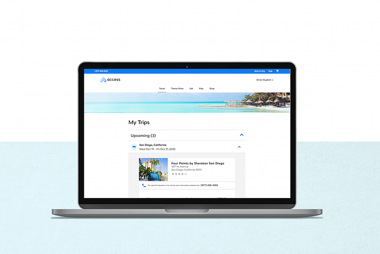
Our challenge was to design a new My Trips page that would provide users with a clear and comprehensive view of their upcoming and past hotel bookings, while also simplifying the navigation and reducing the number of steps required to access this information.
Approach
We started by conducting user research to understand how travelers manage their travel itineraries and what types of information they expect to see on a personal booking summary page. We also surveyed customers who had used our platform to make hotel bookings, to gather their feedback on what types of information and functionality they wanted to see.
Based on our research, we identified the following design principles for our new My Trips page:
Clear and comprehensive: The page should provide a clear and comprehensive view of upcoming and past hotel bookings, including information such as check-in and check-out dates, hotel names, and reservation numbers.
Intuitive navigation: The page should be easy to navigate, with clear labeling and intuitive controls for accessing additional information or taking actions such as modifying or canceling a booking.
Mobile responsiveness: The page should be optimized for mobile devices, with a clean and simple design that makes it easy to access and view information on smaller screens.
With these design principles in mind, we created wireframes and prototypes of the new My Trips page, using Sketch and InVision, and tested them with users to gather feedback and iterate on the design.
Results
Our new My Trips page was launched in February 2023, and the results have been positive. Here are some of the key metrics we tracked:
Improved user engagement: Users are spending more time on the site and accessing their booking information more frequently than before.
Enhanced user experience: Users have reported that the new My Trips page is easy to use and provides a more comprehensive and convenient view of their bookings.
Reduced customer support inquiries: Customers are now able to find the information they need on their own, which has reduced the number of inquiries to customer support.
Positive feedback: Customers have been pleased with the new page and have reported that it has improved their overall experience with our platform.
Conclusion
Our new My Trips page has improved the user experience for customers who have made hotel bookings, by providing a clear and comprehensive view of their itineraries and reducing the complexity of accessing this information. By applying user-centered design principles and collaborating closely with our customers, we were able to create a page that met their needs and resulted in increased engagement and customer satisfaction.