The Harbor
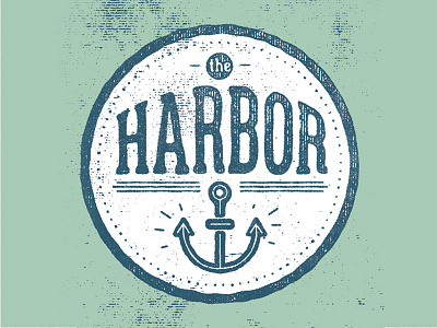
this is the approved final with my client - originally I was going for the clean approach but the grudge texture represented the brand more accurately. Personally I'm on the fence about it. The anchor will be used as the brand's icon.
this is the approved final with my client - originally I was going for the clean approach but the grudge texture represented the brand more accurately. Personally I'm on the fence about it. The anchor will be used as the brand's icon.
