Design Journey of Dotta: A Tale of Trust and Innovation
I'm excited to share the behind-the-scenes journey of crafting the visual identity for "Dotta," our revolutionary API-Based Facial Biometric Verification solution!
The Concept: Dotta is all about trust, security, and cutting-edge technology. The concept centered around creating a visual language that conveys reliability and innovation. The idea of using facial recognition as the key element signifies the advanced nature of our solution.
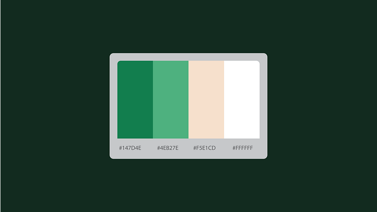
Color Palette: The choice of two shades of green was deliberate. Green symbolizes trust, growth, and balance. By using different tones, we aimed to strike a balance between the cutting-edge technology (represented by a darker green) and the reliability and trustworthiness of the solution (reflected in the lighter green).
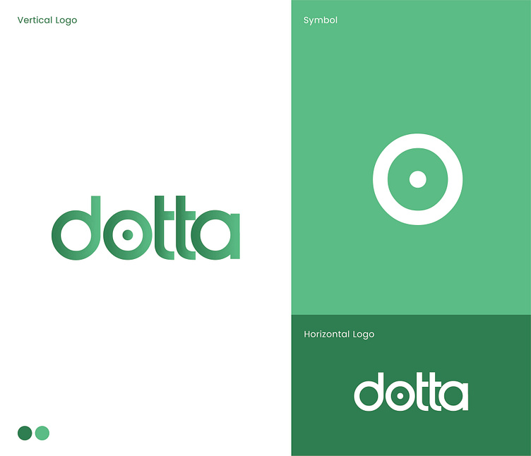
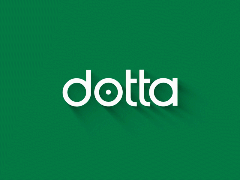
Logo Design: The heart of our brand identity lies in the wordmark logo. Placing a circle dot within the letter "o" not only creates a visual connection to our solution but also represents the seamless integration and accuracy that Dotta brings to the table. It's not just a logo; it's a symbol of trust and precision.
Crafting the Story: Every curve, every shade, and every pixel tells a story. We wanted Dotta's visual identity to narrate the narrative of reliability, security, and technological prowess. Each element in the design has a purpose, contributing to the overall message we want to convey to our users and the marketplace.
Your trust means the world to us, and we're excited to share this journey with you. Together, let's redefine the standards of trust in the marketplace! 🌐💚
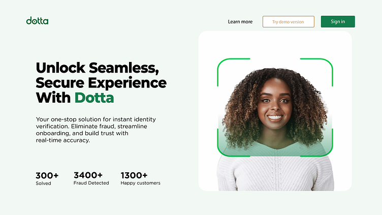
Visit : www.withdotta.com to secure your customers.
⭐️ Would like to get a logo animation?
Feel free to reach out Via our dribble DM
