FYR Diagnostics Rebrand
FYR (pronounced fire) approached me with a need for a brand identity system, a full suite of brand collateral, and an enhanced website that better reflects its evolution since its inception. I worked with them to create a scintillating brand to differentiate them from their competitors, ignite enhanced interest from investors, spark engagement from customers, and enkindle buy-in.
The Goal
The goal was to transform FYR's brand into a sleek, modern, and clean biotech brand. At first, they weren't sure how to articulate their "why", or rather their unique value proposition as a company, or articulate their offerings to their audiences. Their then-current brand lacked cohesion or consistency. Like many small businesses, they were focused on building the business not talking about it.
The Gap
The gap between FYR's brand transformation and clarity around FYR's why was too far to cross by diving into design alone. So before diving into the visual identity system, I guided FYR through a journey to articulate their business purpose effectively by leveraging Simon Sinek's Golden Circle method. I then dug even deeper into crafting a tagline, mission, and brand archetypal mix to revolutionize their brand messaging and positioning. Their desire to innovate and transform didn't stop there! Now we were able to move forward into developing the visual design system with full clarity on who FYR is, why they do what they do, and how that serves their target audiences.
To maintain a constant state of alignment throughout the rebranding process I leveraged style scapes. My goal at this point was to prevent my client from receiving any unwanted surprises and to make the conceptual as tangible as possible. After reviewing industry competitors and discussing what was or was not working for them, it was time for me to sit down and draft 3 style scapes with the desired design considerations in mind. The three style scapes featured an approach ranging from mild (most conservative), to spicey (most disruptive). Not unlike picking your favorite ingredients for your favorite chili, this allowed us to work together and share a simple common language on what was working, what was needed, and what came next.
The Gamble
Did someone say spicey? After 3 rounds of revisions, FYR's Leadership team was ready to turn up the heat and move forward with the most transformative, bold, and defiant of the three proposed options. A fitting choice for a heroic company with an outlaw edge founded on insuppressible grit, out-of-the-box thinking, and an unstoppable determination to do good. The ultimate deciding factor? The hot and cold color palette. As an element, we typically think of fire in the usual colors of red, orange, and yellow. However, when you turn up the heat it's white-hot. When you add certain chemicals it can change the color to green, blue, or even purple. In every sense of the word, the color palette represents fire transformed.
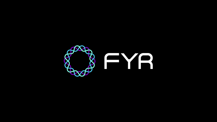
For the logo icon, I was inspired by the cross-section of an exosome with all the lumps and bumps of the lipid bilayer and the nebulous ribbons of RNA and mRNA. All of that is just a fancy, sort of sciencey way of saying I was inspired by the core of what they do, thinking inside the cell to transform the next generation of liquid biopsies. The tri-color approach to the icon disrupts the status quo of FYR's industry and allows them to further stand out from their competitors. For the wordmark, I started with Stange, a geometric sans-serif font with an abundance of potential, that I then transformed to further encapsulate the logo’s future tech feel. The customized word mark features both round and sharp corners to symbolize the fluidity of fire and liquid as well as the rigidity of FYR's resolve to innovate diagnostics and transform healthcare for patients.
The Gain
Ahead of their Series A raise, FYR's seed-stage investor was blown away by the first run of FYR's new pitch deck designed by moi. They have since asked for permission from FYR to use FYR's new non-con deck as, "A shining example to our other portfolio companies of what good deck looks like." FYR's collaborator, Element Biosciences is also excited by the new brand, website, and more to come. Element's own, Senior Director of Strategic Marketing referred to the new website by simply saying, "It all looks beautiful!"
In short? Before FYR even began pitching for their raise (ongoing) they began garnering the right reactions from the right audiences. Stay tuned for more on FYR's gain when they announce the close of their Series A! ;)
FYR Dx is the catalyst to innovate diagnostics and transform healthcare. They transform healthcare by developing diagnostic solutions that utilize novel insights on disease to innovate the next generation of liquid biopsies. They bridge the gaps between healthcare, patients, and disease. Want to learn more? Please feel free to visit me at: www.woodsecreativeco.com


