Rebranding a Space Travel Site with Design Systems: A Case Study

As a part of Dribble’s Scaling Design Systems course, I used a design system to manage the rebranding of a fictitious space travel company with ease.
Quick Links
Here is a link to the screens I created for IPTS in Figma.
Here is a link to the screens I created for Shuddle in Figma.
Here is a link to the landing page I created for Shuddle in React.
Here is a link to my npm package I created in React.
Feedback from Dan Mall (instructor of the course) on my project.
The Challenge
As the Head of Digital at IPTS - The Interplanetary Travel Syndicate, a transportation network that shuttles people from world to world within our galaxy, I was tasked with designing screens for the company’s three unique offerings:
Ipts.org, an informational website where you can find the latest news and happenings with the IPTS
IPTS Travel, a website where you can browse and book travel to and from multiple destinations within our galaxy. Like Expedia for space.
IPTS Rail, a real-time updated web app where you can view lines, routes, and times for all the different commuter lines. Think NYC subway or the London Underground, but for interplanetary travel.
After I designed and finalized the screens, I was presented with a twist!
The leadership at IPTS hired the prestigious branding firm Megabrand to rebrand the entire organization. Megabrand decided to rename IPTS to Shuddle and provided new imagery, typography, logos and color scheme.
My job as the Head of Digital, was to quickly redesign the screens to meet the new branding requirements. By using a design system, I was able to add the new branding to my components and give the screens I designed earlier an entire new look and vibe with minimal effort.
Read below for in-depth details on the process
Inspiration
Before I started creating screens for IPTS, I decided to take some time and research space websites.
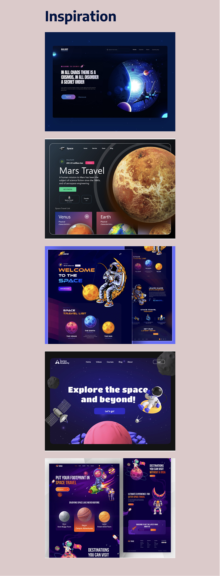
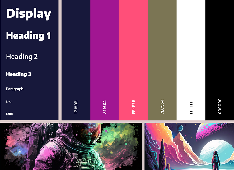
After looking at my inspiration, I immediately knew I wanted to go with a dark aesthetic with pops of bright color.
For the typography, I decided on the Encode Sans font family since it has a welcoming and impactful feel. I also used Midjourney to create images based on the look I was going for.
I kept the typography and color palette simple to start with it and only included what I needed as I designed the site.
The typography, colors, and use of imagery combined help invoke an intriguing but also friendly and inviting vibe.
Research
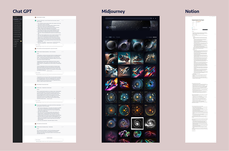
Since space travel doesn’t currently exist for the average human being, I knew I needed to do some research. I decided to use ChatGPT and Midjourney to gather information and images. I took a lot of notes and put them in a notion document. It was the first time I used these AI tools and it was a lot of fun to conduct research this way! I was able to gather some realistic copy to use in my design as well.
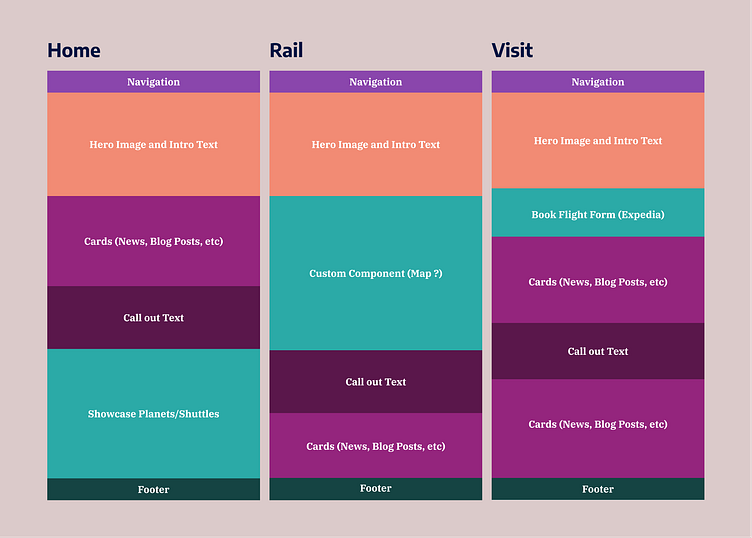
Next, I put three frames side by side in order to start thinking through reusable components and custom components to place on each screen. Doing this simultaneously was very helpful, as it gave me a big picture overview as I was brainstorming what to put on each screen.
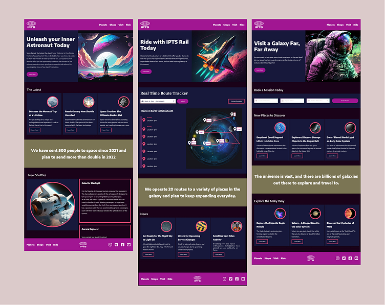
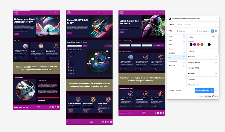
IPTS Final Design
Below are the final screens I developed for IPTS using a set of six reusable components:
Navigation
Footer
Cards
Button
Hero
Text Call out
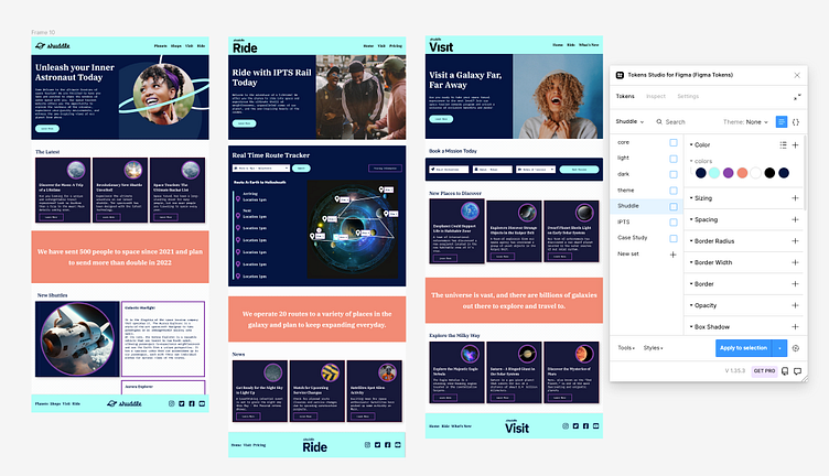
Rebrand: From IPTS to Shuddle
As mentioned earlier, as I settled on the final designs of my screens to showcase to users, IPTS rebranded to Shuddle. I was given a new color scheme, typography (IBM Plex Serif and IBM Plex Mono), and imagery.
The branding firm, Megabrand, decided to go for a cooler, younger, and fresher feel since the research they conducted found that users felt that the IPTS name and logo felt very ominous.
Initially, I felt pretty stressed out on how I would accomplish the redesign since the look I had created for IPTS differed significantly from Shuddle.
However, I realized that since I used design systems, I would be able to approach the redesign piece by piece by evaluating each component I had created earlier for IPTS.
Once I started doing this, I started to see the change in my designs and was amazed at how changing the components helped create an entire new design.
Below are the three screens with the new design
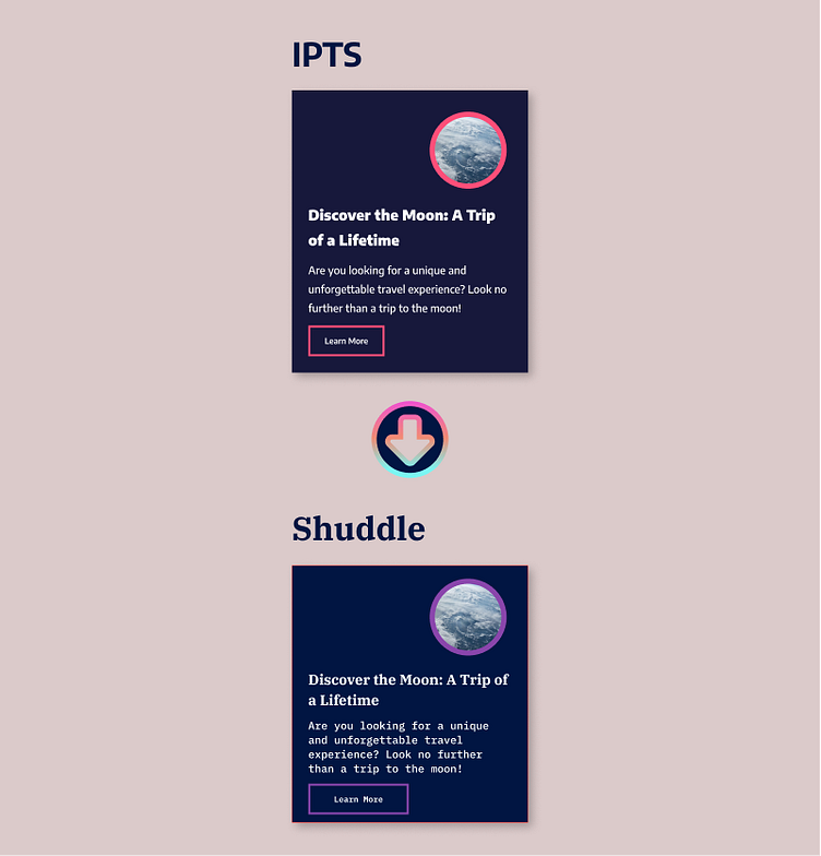
Components
I took some before and after shots of my reusable components as I rebranded them to Shuddle
Cards
The Card component is the component that is most visible on all the pages and so I was eager to see how the new branding would impact the card. The card did not change much with the new typography and color scheme, since I structured the card to have a flexible design and structure.
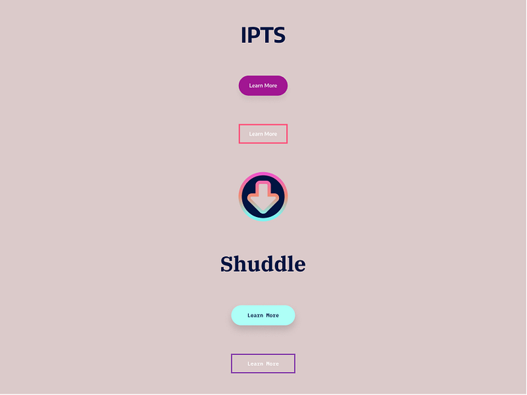
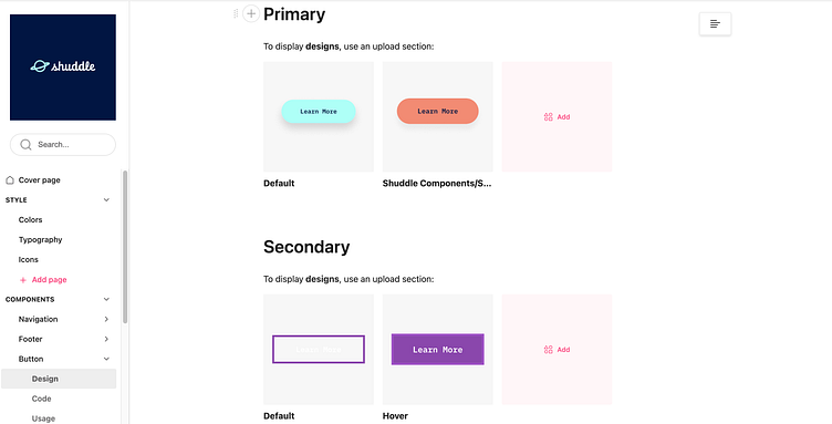
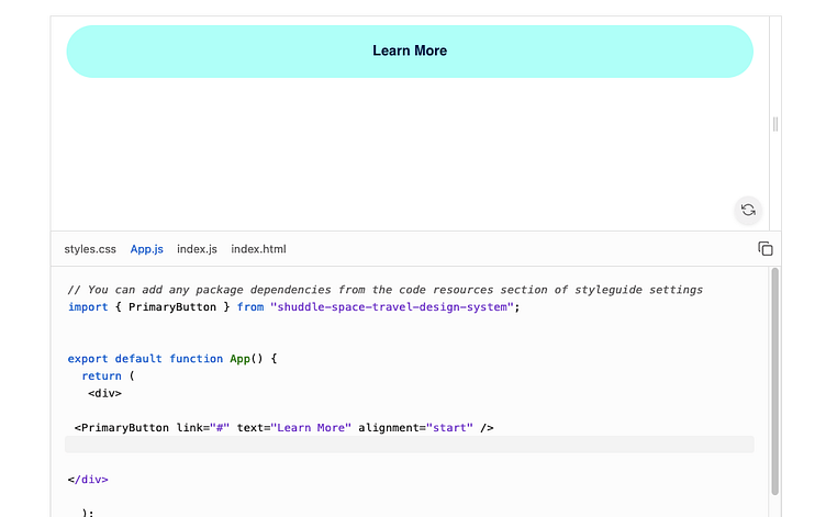
Buttons
For IPTS and Shuddle I decided to use the secondary color to be the primary button's color and then used an accent color for the secondary buttons as an outline.
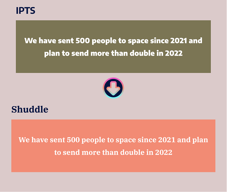
Text Callout
I created the text callout component to have an area on the screens where one could showcase key information. The change here was pretty straightforward and simple to make since the only changes required was the fill color and typography.
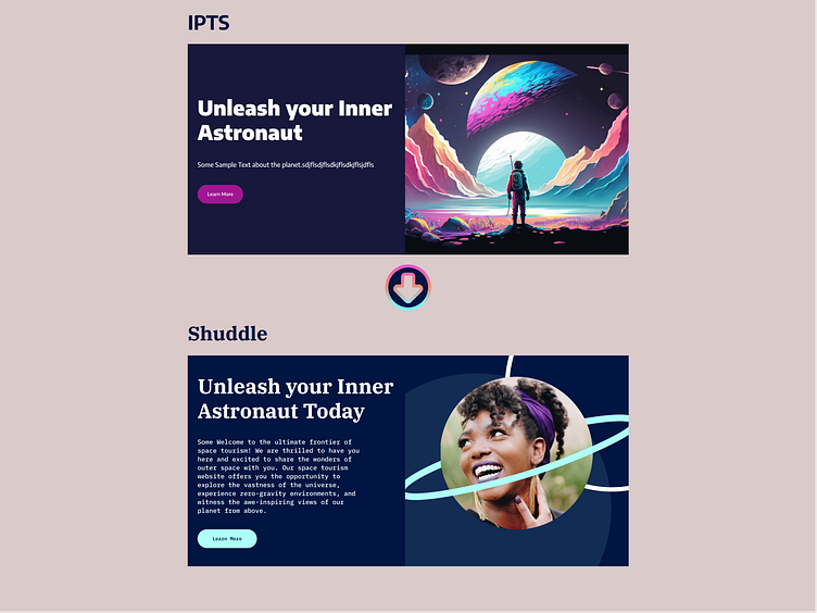
Hero
The design of the hero was intentionally designed to be flexible so that I could accommodate various copy text and images and use it on different screens. Just changing the image altered the look of the entire hero component pretty dramatically.
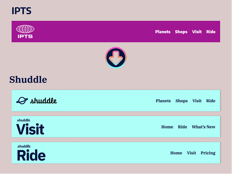
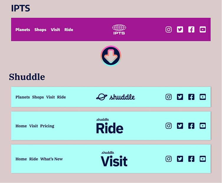
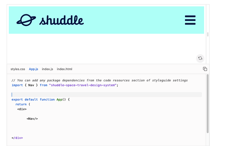
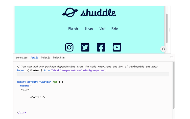
Navigation and Footer
MegaBrand provided three separate logos, whereas, IPTS just used the same logo for all of it’s products. This introduced a bit of challenge, but I was able to overcome it by creating a logo component and then adding that to the Navigation and Footer components. I was then able to create variations of the navigation and footer components which gave me the flexibility to use the same component on all the screens.
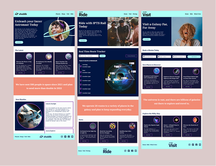
Before and After Screen Comparison.
I wanted to include some before and after shots of each screen so that one can see how updating the design system can change the look of an entire screen instantly.
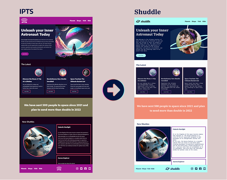
IPTS.Org to Shuddle.World
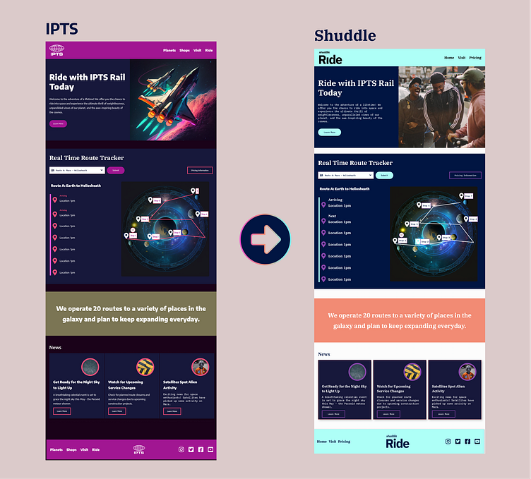
IPTS Rail to Shuddle Ride
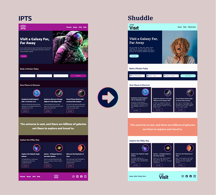
IPTS Travel to Shuddle Visit
Documentation for both Designers and Developers
I used ZeroHeight to document my design system. The tool allows you to connect your figma file and also import your npm package so that you can import your components and styles.
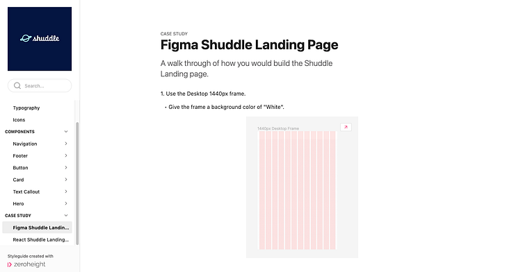
I included a case study for other designers to be able to build out a page in figma using components.
I also included a case study for developers to be able to build out a page in react using the npm package I created.
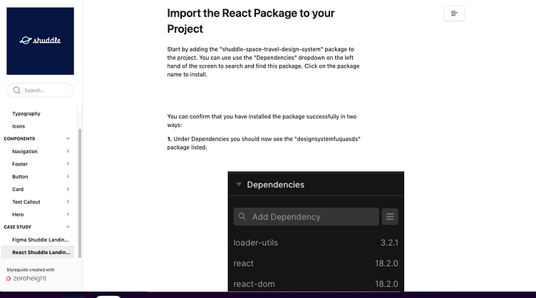
Creating a case study that goes through in step by step detail on how one would build a sample page was a very practical way of assessing if the design system I created is simple enough to use and follow. In the real world, I imagine that this process would open up dialogue on how to improve components and simplify them for other designers to use in their designs.
Coding it Up!
I wanted to challenge myself by coding up these components in React. Having never coded in React, I had to learn enough React to be able to learn how to create components, pass properties to the components, and then how to export them into a package that others can use. After several tries, I was finally able to do it and learned a lot. You can download my package here and see if you can create a page for Shuddle.
Here is a link to the landing page I created for Shuddle in React.
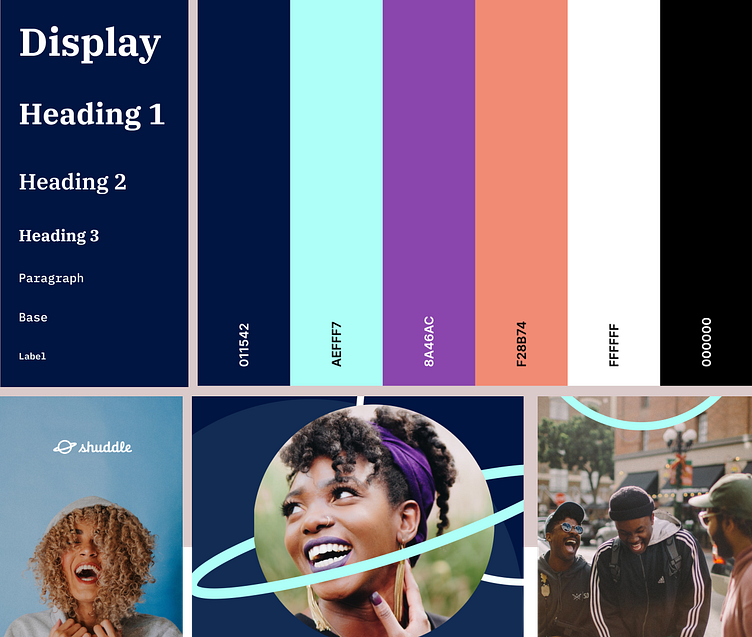
Design Tokens
While coding up the components, I quickly realized I needed to use Design Tokens in order to manage my variables in a more organized and efficient manner. For this case study, I decided to focus on just colors, but plan to experiment using other elements such as typography and spacing as tokens next. I used the Tokens Studio plugin in Figma to accomplish this.
Color design tokens for IPTS:
Color design tokens for Shuddle:
Once the color tokens were created, I was able to export a json file that listed all the colorsl
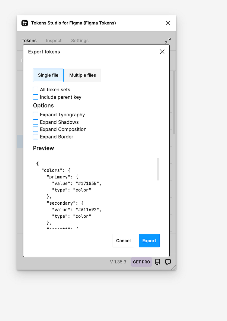
I then used this JSON file to assign the color tokens to variables that are linked to css properties for the components in my React Application.

Below is a video showing how easy it is to switch the look and feel of a website through the use of design tokens. In the video, I show you how the website looks with one color scheme (the IPTS color scheme) and then by exporting the design tokens I created for the Shuddle color scheme in Figma, I am able to easily switch the entire page to use the Shuddle color scheme!
Conclusion
Design systems are amazing to work with and should be incorporated in projects where you know you can reuse the component in at least three screens.
Working with a design system from the start, forces you to systematically think about your design and be efficient.
I especially learned that the naming convention of your color scheme and variables is important so that your project makes sense semantically and you are able to change design elements such as colors easily if everything is organized and easy to understand.
I've learned that Design Systems also frees up room to be creative with other components that are not reusable.
I am proud of the work I've done in the course and the capstone project. I challenged myself to use design systems in both Figma and React. I look forward to furthering my knowledge of creating design systems and using them in future projects!