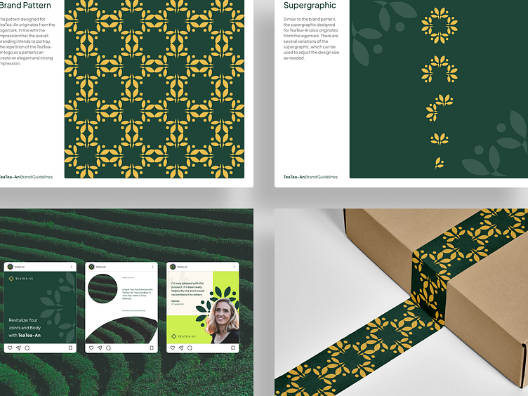
TeaTea-An — Brand Pattern for Premium Green Tea Product
Hi there!
I would like to share the results of my logo design exploration for a premium green tea product company called TeaTea-An. Previously, I created a website design and logo design. You can see the previous design results at the links below:
Overview
TeaTea-An targets older individuals who want to maintain joint health with their high-quality green tea. To ensure consistency across various media, including print and online, it's essential to have a unique visual characteristic beyond just the logo. This is where a brand pattern comes into play.
Challanges
A brand pattern should be consistent and provide an appropriate impression for the brand's overall image. It complements other visual identity elements, such as the logo, and needs to be designed carefully to provide a unique visual characteristic that signifies the brand.
Goals
The brand pattern's purpose is to ensure that all design results align with the brand's visual identity. It supports aesthetics and maintains consistency across all media platforms, making it easier for the audience to recognize and remember the brand.
Heading
I hope you enjoy it!
Feel free to leave comments and feedback. And if you find my work useful and you like it, please don't forget to leave a love and save it. Last but not least, don't forget to follow me to get more updates in the future.
---------------------------------------------------
I am also available for new projects.
---------------------------------------------------
Let's Connect!


