ThreadMeUp Mockups Comparison

ThreadMeUp is starting to work towards catering artists/designers and giving more tools and freedom to designers who want to make some really cool apparel. Our current platform has apparel mockups that marketers requested specifically. However, these mockups do not suit all who want to use them.
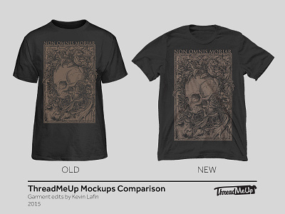
Currently, most of the mockups are stiff an noticeably filled with a "hollow" model. Today, we tested a new mockup with the shirt simply laid flat and spread out- glorious imperfections, wrinkles, and all to give the shirt it's natural and organic feel, yet retaining a noticeable and open canvas for graphics.
The current goal of this is not to replace the old, but to give users on our platform more view options to place their artwork on. The end goal is to gain feedback and flex accordingly to how users like these various "loose" mocks and replace the stiff mocks altogether.
Previously, our mockups were saved out as individual files for ever color that product offered. With the "New" version, the system would save the base layer of the shirt, the shadow layer, highlight layer and use CSS to apply the shadow layer to the graphic layer that the user uploads to give it an "authentic" and realistic feel. Users will have the options to choose from various wrinkled shirts- whether heavy wrinkles or light to pick the canvas just right for their graphic.