Charity - Brand Guidelines & Visual Identity
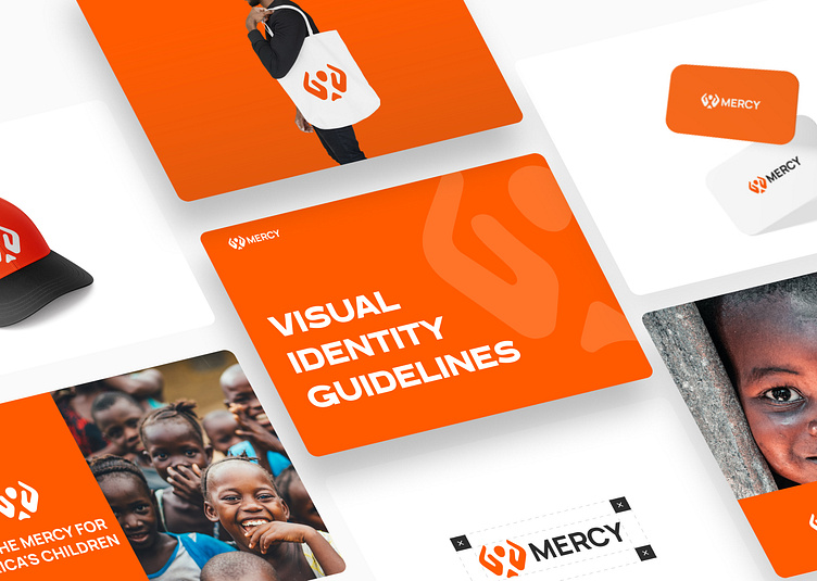
🌍🧒🏾🙏 We offered branding services to a charity organization that works for the welfare of poor children in Africa. Our goal was to create a design that conveys hope and compassion, and inspires donors to make a difference in the lives of African children.🎨
Our design features two hands holding a child in between them, with the name "Mercy" written in a modern sans-serif font in orange. The logo represents the organization's mission of providing support and care for vulnerable children in Africa.💡
We chose a color scheme of orange and green to represent warmth, energy, growth, and hope. Orange also symbolizes creativity, enthusiasm, and optimism, which are all qualities that align with the organization's mission.🌟
Our tagline, "Be the Mercy for Africa's Children," reflects our message of inspiring people to make a positive impact and give hope to Africa's most vulnerable children.If your charity organization needs branding services, contact us to learn more about how we can help you make a difference!
✨AVAILABLE FOR NEW PROJECT✨
So feel free to contact us at : 📩
👇Follow us on👇


