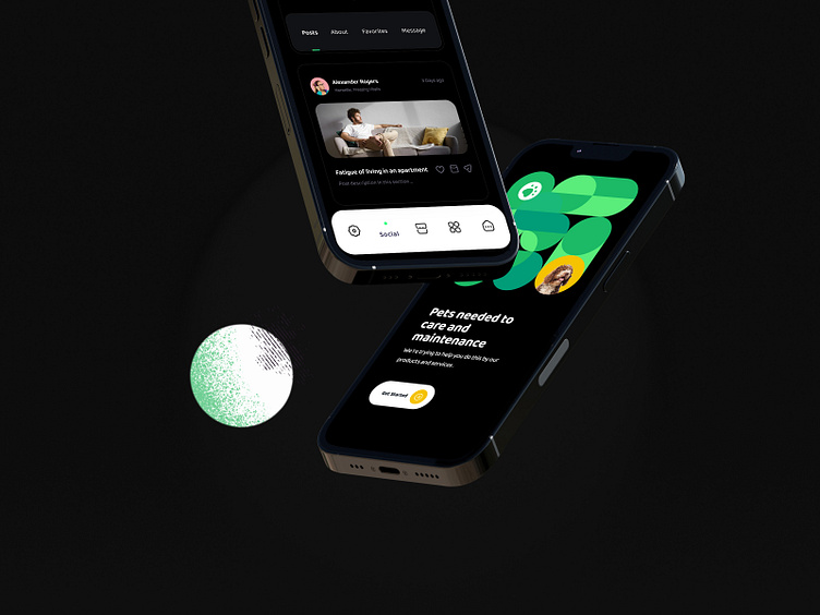
Pet Adoption App | Dark Mode
Hi, Dribbblers! 👋
Today I am sharing the dark version of my exploration about pet care e-commerce app with you, for those who love to take good and better care of their pets.🐶🐈
Hope you like it, Feel free to give feedback. And don't forget to press "L" or the love button if you like it 😊
Contact us now !
In a dark theme, dark surfaces occupy the majority of the UI. Accent colors are typically light (desaturated pastels) or bright (saturated, vivid color) to help accented elements stand out. They should be used sparingly to accent key elements, such as text or buttons.
Soo, what do you think?
I hope you will like the project ! Read our case study to learn more 🔥
✉️ Have a project idea? We are available for new projects at saeedyousefi@live.com | Send me a message
More by Saeed Yousefi View profile
Like


