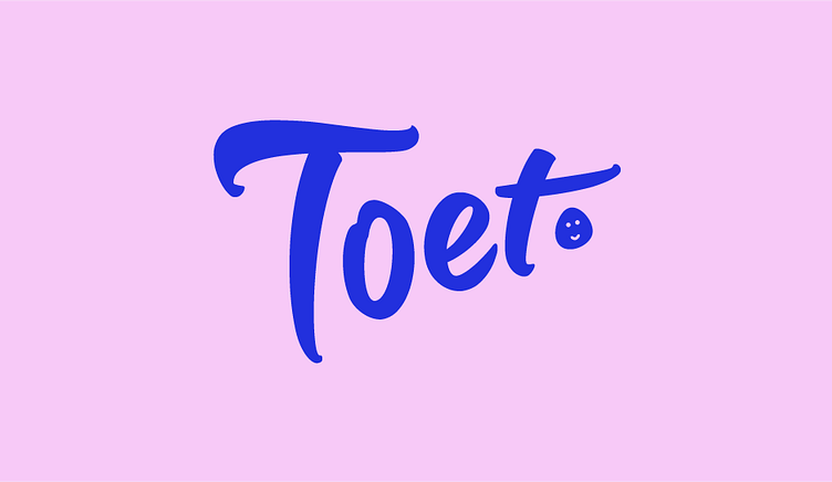
Memorable, slick and energetic. The new TOET Identity
Enter your text here...TOET had just started out as a brand new clothing brand for children. They wanted to create a logo that was memorable, easily recognizable and suited for prints. Together with the client we sat down to look at what brand pillars and emotions connected with TOET, and from there we went on and challenged ourselves to come up with a logo that would stand out in the playing field of young fashion.
Enter your text here...After playing around with different font styles, we went for a bold but friendly font. The logo is energetic and friendly, and it also comes with a pretty cute emblem that we like to call the “TOET eggface”. The eggface can be put behind the word as a bold dot but it can also be used on sweaters or as an icon in socials or in the webshop. The eggface is already an iconic and recognisable favorite of the customers! Customers can order some ready-made sweaters with the logo and the eggface is a popular choice in the webshop.


