Online Floral Delivery Service - Logo Design
Designing a Logo for a flower delivery brand...
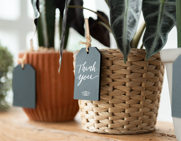
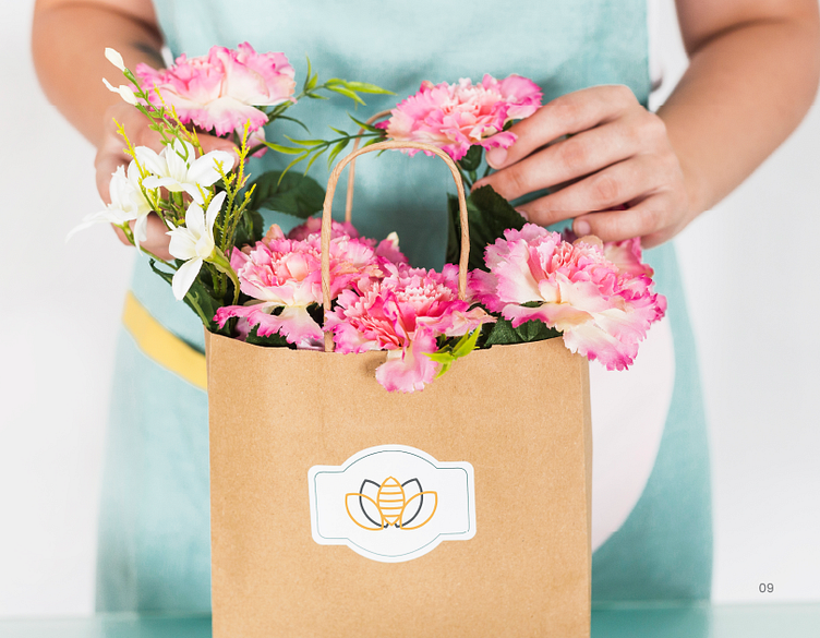
Bee My Florist is an online florist company that is passionate about bridging the gap between the local florist who develops the orders and the purchasing consumer, while maintaining integrity of that order by the time it reaches the recipient.
During the onboarding process, it was expressed that the main goals of BMF were to develop a strong sense of connection with their respected network and establish themselves apart from the competition through clear branding.
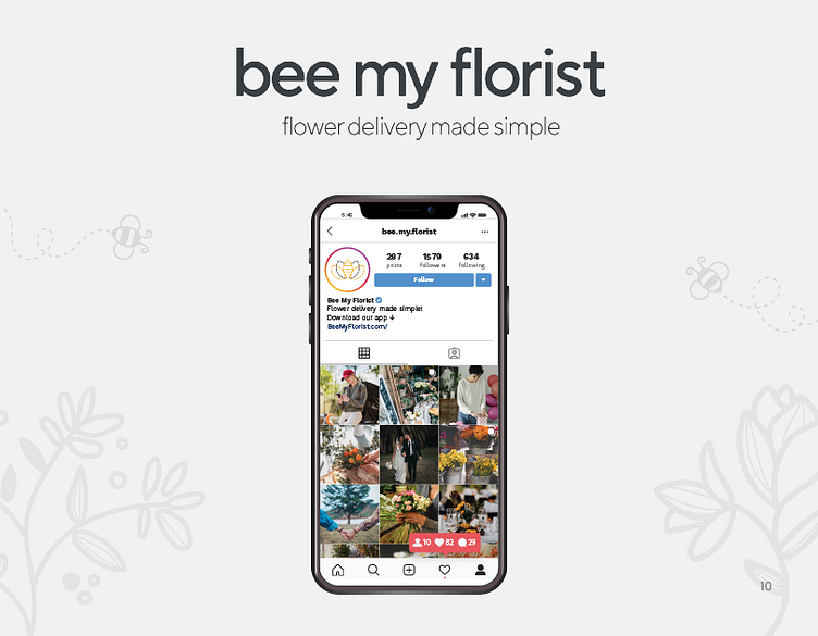
The core values of the brand were to send a message of professionalism, positivity, and simplicity while maintaining a modern feel to consumers, ideally, the stay at home working mom.
The Concept & Problem-Solving:
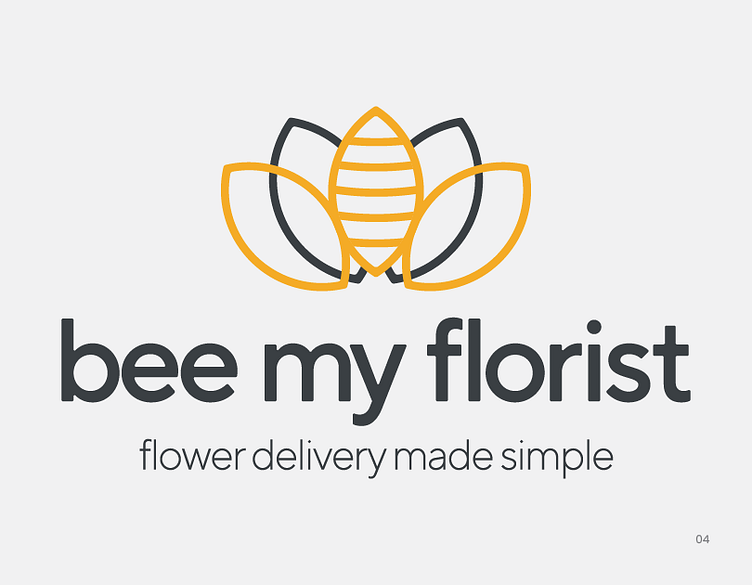
The logo was meant to symbolize unity within the community and bridge the gap between the customer and the florist that receives the order. Each flower petal was originally meant to intertwine with the one next to it showing the connection.
However, once the color palette was chosen and details started being integrated, with the intertwine effect (used on Adobe Illustrator), the symbol of the bee became less aesthetically pleasing to the eye. Ultimately, the decision was discussed with the business and they agreed to remove the intertwine effect to make the bee stand out, which was important to them.
This logo represents the requested core values of simplicity, stress-free and modernism while never losing quality on a small cellphone app.
Typography & Color Palette
The font-family chosen was a custom font by the name of TT Norms Pro (available by TypeType). TT Norms Pro is a highly respected sans serif font that is typically used for minimal logo designs - great for large displays as well as small screens. Lower case lettering was used to maintain a "feminine" and welcoming feel to the brand.
To maintain the requested simplicity, a full color palette was provided (to aid in future projects such as a website or app creation), however, only two colors are used in the logo itself - both representing good vibes and hope (gold/yellow) and sophistication and professionalism (rich black).
Market Research:
After revealing the logo to a private test group of almost a dozen women between the ages of 35 - 65 and careers ranging from mid-level employees to solopreneurs, the following results were recorded...
• 100% approval for final logo when compared to earlier concepts
• Majority vote determined that current typeface would catch their eye in the app store or on social media
• Majority vote determined that current logo would be memorable.
• 100% voted that current logo delivers clear messaging.
Final Thoughts:
I never honestly thought I would be designing a logo for a Florist company. But once the discovery call was done and the client was passionate about maintaining a minimal and professional look, branding concepts I'm passionate about, I decided this could be something in my wheelhouse to try. I'm not going to lie though, it was a challenge making a florist logo that hasn't been done a million times before. Regardless, I'm happy I took the chance on working with the company and I look forward to hopefully helping them with their UX/UI needs once the mobile design gets underway!
What do you think? Let me know your thoughts!
-Taylor Rodriguez
taz.mktg@gmail.com