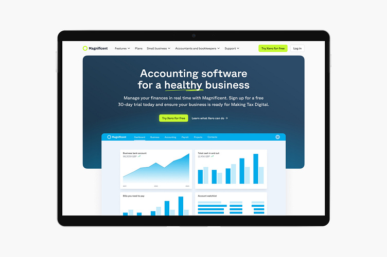
Landing page - #003
Two of the UI Daily challenges in one day, why not?
With this landing page I pulled a bit from Xero's copy. I went trigger happy on gradients but that's the beauty of these exercises—no limit.
I'm not 100% on the colour selections here but I don't want to be precious. The yellow green is pretty web3. I love the glow on that central CTA on the corporate blue grey of the bounding box.
Font: Gt Planar Trial from Grilli Type.
More by Maxwell White View profile
Like

