Achetons local® - Logo branding
Achetons local® - Logo branding
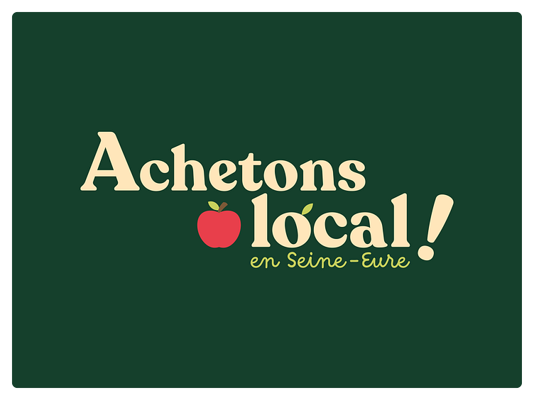
The logo of the "Achetons local en Seine-Eure" network perfectly reflects the values of this network which showcases local producers, artisans, restaurateurs and businesses to encourage short circuits.
The colors used in the logo are green, beige, apple red, and brown. Green symbolizes nature, freshness, and ecology, while beige and brown evoke the earth, proximity, and quality of local products. Apple red, on the other hand, recalls the deliciousness and abundance of local fruits and vegetables.
The typography chosen for the logo is round and playful, expressing the roundness of fruits and vegetables and the friendly side of the seller. This typography adds a touch of conviviality to the logo, reinforcing the idea of a warm and welcoming network.
Overall, the "Achetons local en Seine-Eure" logo is simple, effective, and memorable. It embodies the network's values and attracts the consumer's attention by reminding them of the importance of consuming local to preserve the environment and support the local economy.
