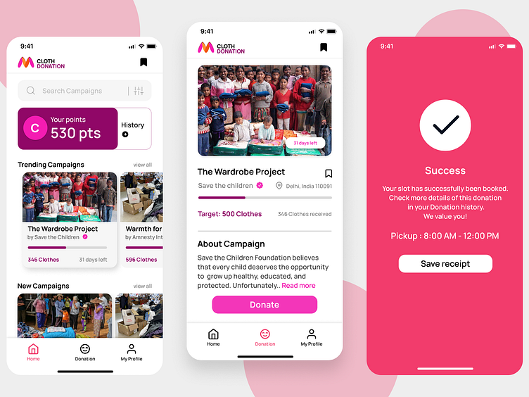
Myntra App Redesigned | App UI | iOS
Myntra Donation UI Designs.
I created the above designs as a project of "Redesigning a popular application" Simple and intuitive navigation:
Attractive and appealing design: The design should be visually appealing and engaging, with an attractive color scheme and well-organized layout.
Clear donation process: The donation process should be easy and straightforward, with clear steps for the user to follow. Make sure users know exactly what they need to do at each stage.
Mobile responsiveness: Since the application is being designed for mobile, ensure that the user interface is responsive and optimized for all mobile devices.
Pickup and drop option: Provide users with an easy and convenient way to schedule a pickup and drop off their donations. Include a calendar or scheduling tool to make it simple for users to choose a time that works for them.
User feedback and reviews: Include a feedback system that allows users to rate their experience with the platform and provide feedback on any issues or areas for improvement.
Social sharing: Encourage users to share their donation experience on social media, to increase awareness and encourage others to donate.
Thanks ✌️
