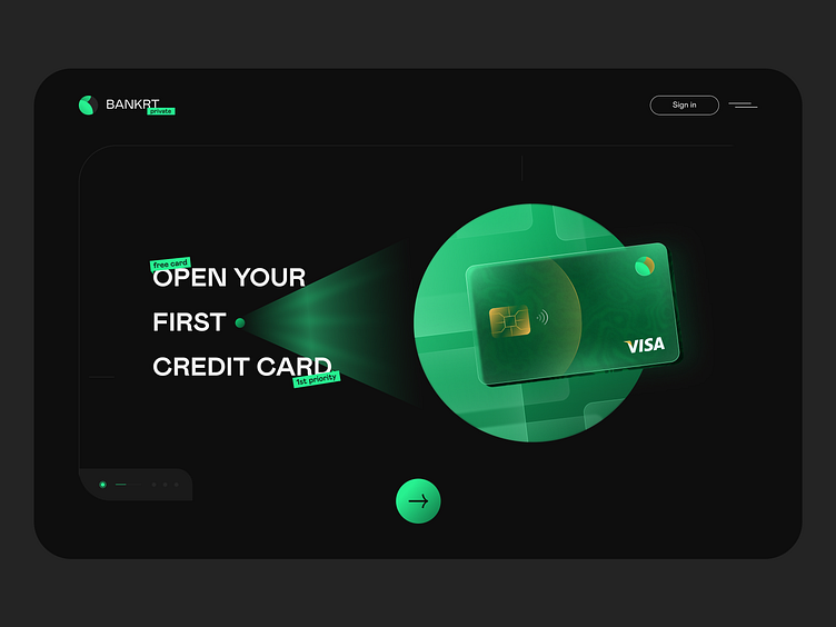
Darkmode Web design
💡BankRT showcases a clean and modern aesthetic. The use of white space and minimalist elements allows for easy navigation and focus on important information. The dark color scheme helps users ignore unnecessary information and focus on useful information. There are many interesting shots in our project—Have a project in mind? Feel free to contact us - hello@pitstudio.co
Don’t forget to ❤️ Press “L” to support the shot here.
More by Pit Studio ✪ View profile
Like


