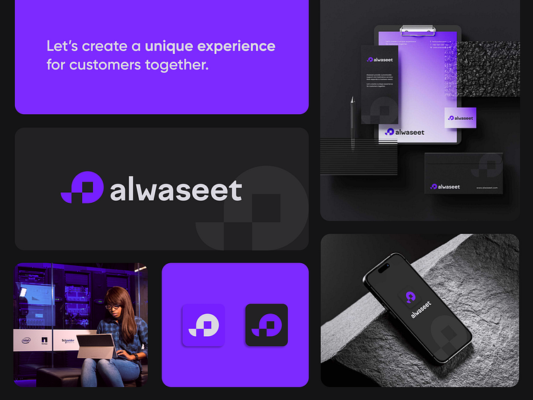
Logo design for Alwaseet

Alwaseet, a company from UAE, is focused on connecting customers with service providers mostly targeting the Hospitality and F&B sector of UAE and other GCC countries.
Alwaseet in Arabic stands for the “Middleman / Mediator”, a delicate and transparent highlight of the company’s purpose.
Together with the client we aimed to achieve a minimalist brand identity with a playful, lively and trustworthy vibe. I also considered it needed to stand out among other IT companies and challenged myself to create a branding kit that would totally correspond and clearly communicate Alwaseet’s message to its audience.
For the logo design, I drew inspiration from the Arabic spelling and created a rounded graphic icon that mirrors the “a” in Alwaseet in a way. It also incorporates the idea of QRs, one of the main assets within this type of business, visualized as two squares gently fitting within the primary shape.
I also came up with a playful yet minimalist color palette based on charcoal black and vibrant purples. Gradient transitions support the idea of company’s flexibility, highlighting the balance between the structured vision and a non-sharp approach.
Loved this one? Let us know!
For inquiries: vailioagency@gmail.com
Our links: https://linktr.ee/vailio.agency