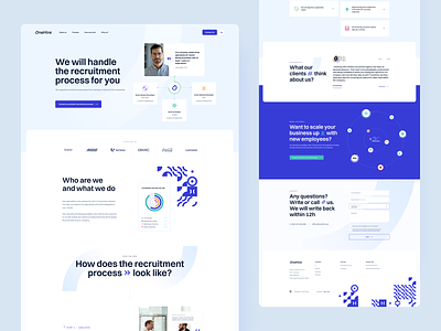
Onehire - mobile version
Who said that the mobile version has to look worst than the desktop?
One of the most important stages when designing a website is the stage of creating a mobile version. 📱
Recently I was working on a project for OneHire, it's time to present the mobile version. 🙌 Read more about OneHire here.
Today I would like to show you a project I've been working on recently. ⬇
The most important features of the mobile friendly project:
🔹 Call-to-action buttons. When designing a mobile website, any buttons that call the user to interact are a very important part of it - they must as visible as it's possible. Remember to keep every clickable areaon mobile larger than at least 40-44px.
🔹 Adapting the design of the mobile version, thanks to which you will reduce the amount of time the user needs to convert.
🔹 Customized and easily accessible navigation.
🔹 Functionalities transferred to the mobile version.
Let me know how you like it this project. ✌️
Hit "L" If you like it. ❤️
Soon more! 🙌
Would you like to implement a branding, website or a mobile application, but you do not know where to start?
💌 Write at biuro@visiontrust.pl and let us find your place in networkspace.
Enjoy and have a nice day! 🚀
Enter your text here...


