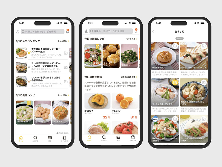
Imitating Japanese Food App - Mobile Design
Hello, everyone! 👋It's my first time show up in this community, I'm so anxious to share my design interface because I'm imitating (really imitate like the real app) this app called "おいしいキッチン" it means "Delicious Kitchen".
I faced so many struggles between the words and layout itself. It's not really different than the interfaces we used to see. Only has so many words or Kana (Hiragana, Katakana, Kanjis -- Japanese language word style) that looks so "crowded" but still this is the minimalist design, aesthetic, useful, and neat that I've ever seen.
Besides, the UX is customized with Japanese people's behavior.
For reading, usually Japanese tend to read like an Arabic, from right to left. In this case, they don't use that kind of behavior. I still figure it out why and how about Japanese interfaces and need to learn so many things for UI/UX Design in Japan for real ever since I work here.
Soon I'll share maybe my journey for making this or I dunno, I have no plans for sharing anything haha.
My hands are tight, my time is limited. So that's all I can share. Thanks for reading!
Let's explore:
