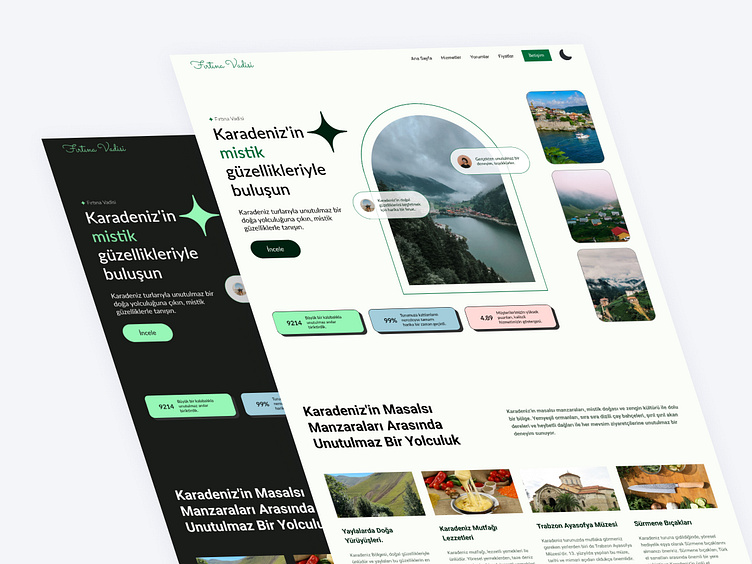
Escape to Nature: Fırtına Vadisi's Tour Website (UI Design)
The UI design of the website for Fırtına Vadisi, a company that organizes tours in the Black Sea region, should be user-friendly, modern, and functional. Below are some suggestions
Colors: Fırtına Vadisi suggests a color palette that includes natural shades of green, blue, and white, which are in harmony with the company's name. The background color should be in light tones to make the content easier to read for users.
Menu: It is important to choose a menu design that users can easily navigate through the website. The main page should include the most important information and tour options.
User Experience: The Fırtına Vadisi website should be designed to meet the users' needs. Tour options, prices, and dates should be easily accessible. Additionally, a simple communication method should be provided for users to ask questions about the tours.
Images: The visuals used on the website should include natural landscapes and photos that reflect the tour activities. This can help users get a realistic idea of what the tours are like.
Mobile-Friendly: It is also important for the website to be optimized for mobile devices. This way, users can easily access tour options and information anytime and anywhere.
Content: The Fırtına Vadisi website should provide informative content that allows users to easily access tour options, prices, tour dates, information about the region, and contact information.

