Ebola crisis tracker
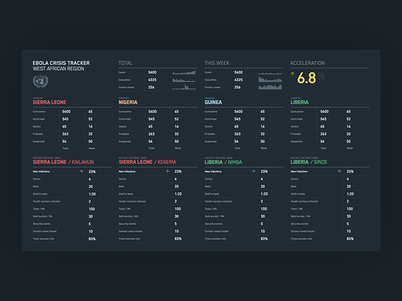
This is the main view of a dashboard concept I designed during the peak of the Ebola outbreak in West Africa. All of the figures are notional, but the countries, districts and categories are representative of the kinds of things we were using to help international aid workers understand the situation. This view was meant to be displayed on an HDTV, and I also worked on black and white A4-sized layouts, optimized for fax transmissions and low-quality photocopying.
Even though this system didn't ultimately wind up being built, this was heavy and interesting subject matter, and I was glad to be a part of the effort to try to help.