Digital Agency Website
Hello, friends👋🌼
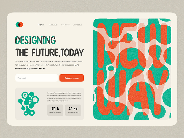
This is my new exploration of a digital agency website. I will tell you a little about this landing.
✨The combination of red and green is known as a complementary color scheme, which means that these two colors are opposite each other on the color wheel. When combined, they create a contrasting effect that can be visually striking and attention-grabbing.
✨Circular patterns can create a sense of balance and symmetry. The repetition of circular elements can create a harmonious and pleasing visual rhythm.
✨The website should have an attractive and visually appealing design that reflects the company's creative abilities.
✨Use red and green as accent colors, such as for buttons or links, to create contrast and draw the user's eye to important information.


