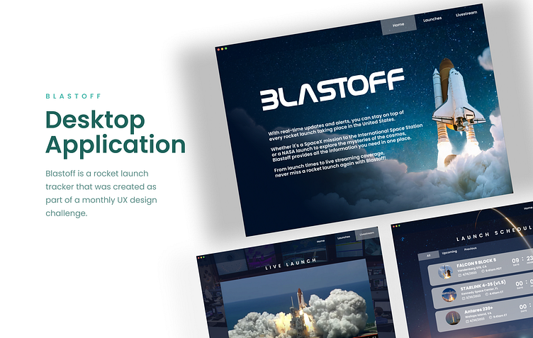
Blastoff - Desktop Application to track Rocket Launches
Overview
TargetUX posted a design challenge to create a 3-page desktop (ios) application to track rocket launches in the United States.
My Role & Process
UX Designer (team of one)
Process
UX competitive analysis
Wireframes
Visual design
Prototype + usability testing
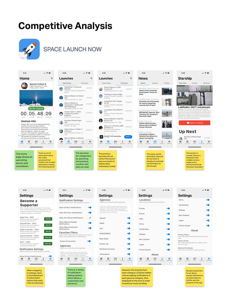
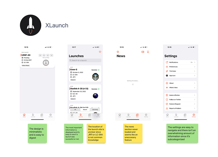
In conducting my research, I initially explored two applications that are designed to track rocket launches. The purpose of this investigation was to gain insights into the strengths and weaknesses of these apps, as well as to analyze the types of information being presented and the manner in which it was conveyed. Through this analysis, I observed a common trend of excessive information being presented in one of these apps, which led me to decide against including a news section in my own design. Instead, my focus was to create a minimalistic design that would prioritize cleanliness and simplicity, presenting only the essential information in the most effective manner possible.
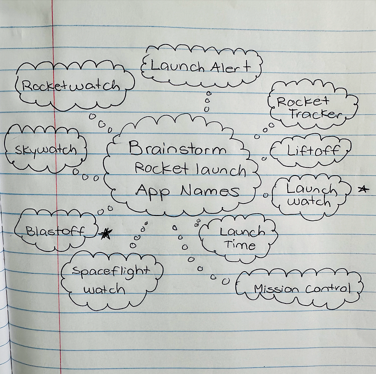
I then decided to start brainstorming names for the desktop app.
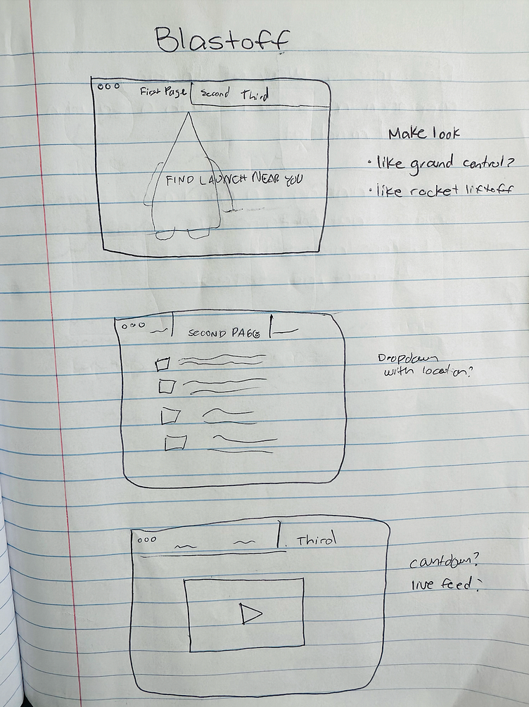
Wireframe
After conducting initial research, I promptly conceptualized the design and deliberated various options for the content to be included in each of the three pages. The primary objective was to ensure that the app effectively conveyed its purpose and provided a straightforward means to track rocket launches specifically within the United States.
Prototype
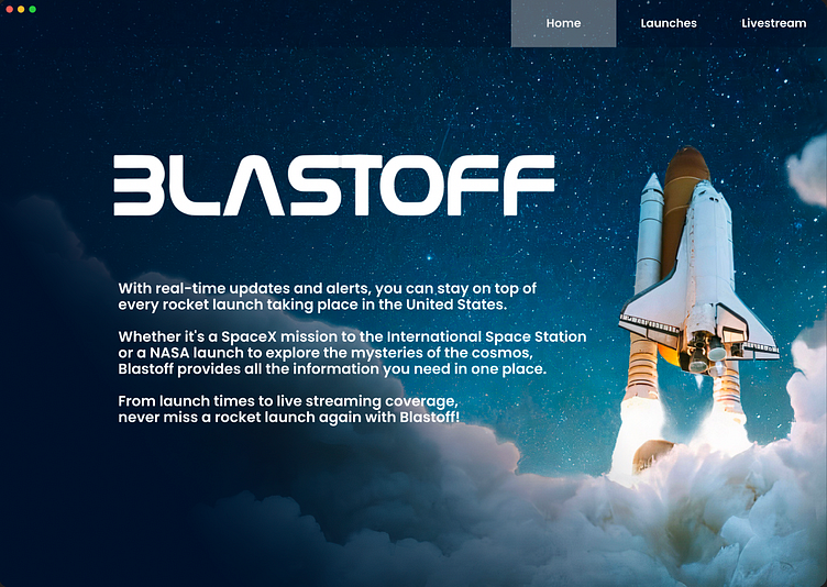
I was in a time crunch to complete this design challenge since I learned about it days before the deadline, so I skipped the low-fidelity prototype and went straight for the high-fidelity design as I worked. This was in hindsight not the best usability practice because after doing some user testing, it came to light that a person who were to regularly use this app would find more benefit in seeing the launches upon opening instead of being met by the current home page every time. This could easily be fixed by making the home page an about page instead.
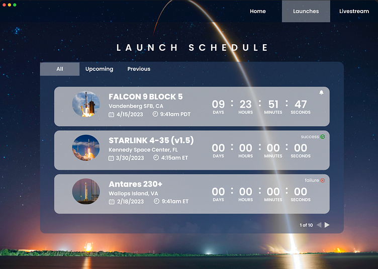
From the information gathered in my competitive analysis, I decided to display just a few launches at first glance in chronological order to reduce cognitive overload and included the option to view upcoming and previous launches.
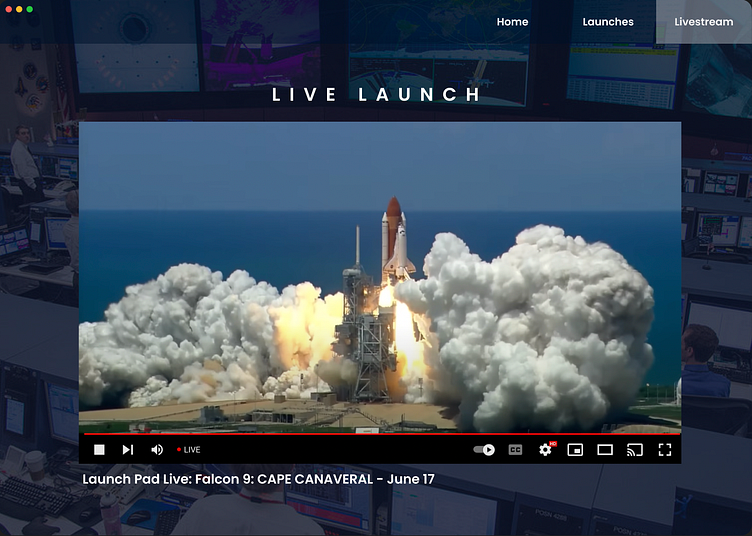
The third and final page consisted of a live rocket launch feed that users could view from the comfort of their homes.
Summary
This challenge was a great exercise in quickly conceptualizing a design and conducting UX research. I definitely would have liked to have had more time to do user research, create an empathy map, and low-fidelity prototype, conduct some a/b testing, test accessibility, and iterate the design process.
Following the submission of my project, I was contacted by TargetUX, who informed me that I had been selected as the winner of this design challenge. As a result, my project was featured and showcased on targetux.org. (see below)