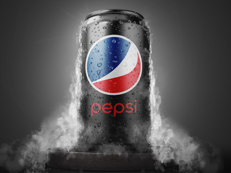
Pepsi's New Logo
Do you think that changing the color is considered a redesign?😅
Did you know that Pepsi paid 1 million dollars to design this logo?🤑
The Pepsi logo of today, which is often dubbed Pepsi Globe, kind of looks like a smile. In the spherical shape, a white swirl divides it into two areas: red and blue. The redesign reportedly cost $1 million and was done by the Arnell Group in 2008.
Font: The word “Pepsi” is a customized italicized roman type, known as Pepsi Light. For a more common typeface that closely resembles the Pepsi wordmark, you can give the Harry Plain font a try.
Color: The color combination Pepsi uses symbolizes the brand’s core emotional values. The dark royal blue, featured in the first-ever drink, is a symbol of “cool.”
How much do you think Pepsi will pay me for this redesign?
You can download this beautiful mockup through the link below