Home Screen Reskin - Mobile Game
What do you think about publishing a design test?
I'm posting this because I really liked the process and the result of this test in a short period of time: "Reskin the current Home screen".
What do you think of publishing the result of a design test, as long as you do not break any agreement between you and the company (NDA for example).
So here's part of the process:
Reskin the Home Screen
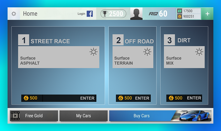
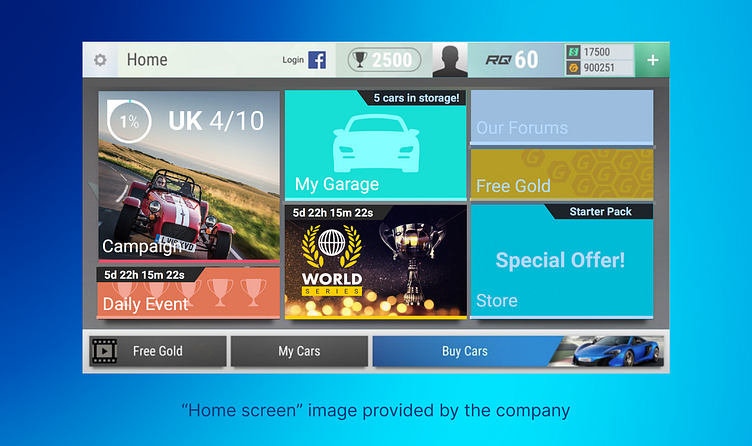
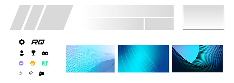
Here's the hi-fi wireframe provided by the company
References
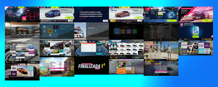
I collected some references from other sources to analyze styles, layouts, components, shapes, colors, etc.
Most racing games have a clean/bold/dinamic design because of their relationship with cars and their type of users, from track to offroad, modern or old, their interfaces and components are mostly square with a blocky layout easy to read, with some exceptions.
Most reference sources have an easily identifiable color palette with good accents for each of its actions, as well as consistency in its components.
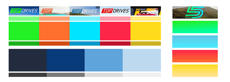
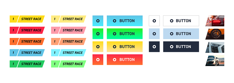
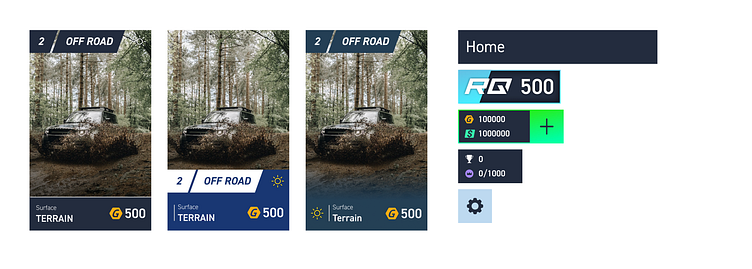
TOP DRIVERS - References
In addition to the Home Screen, more screens and their components were also explored. It is discussed in a little more detail below.
Other parts of the design related to the TOP DRIVES brand were explored, such as the app icon, images found in search engines (google), app store images (Mexico Store), social media like Youtube, Instagram or Facebook. In order to understand the relationship between brand and product.
Other products from the company were also reviewed to find visual strengths and create differences between products to make them distinguishable from one another.
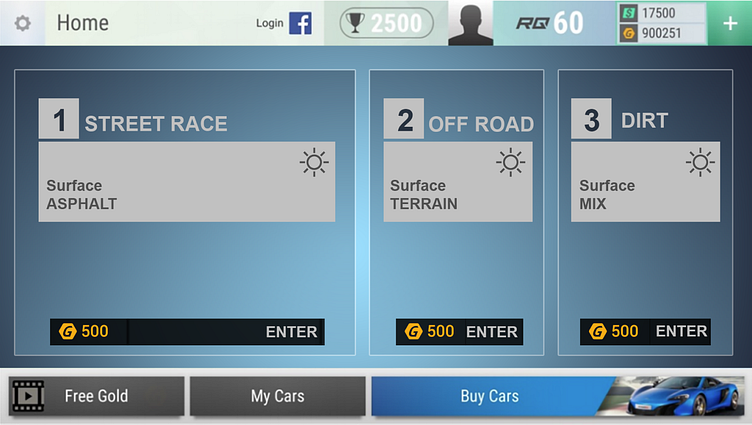
Home Screen Analisys
In my opinion, here are a few visual points to highlight:
While having multiple colors on the same screen shouldn't be a problem, the hierarchy of colors is. We cannot clearly and quickly identify (by doing a visual scan) which action is more important than another.
The design has many levels deep. There is a general gray background (blue in the current game), in front of it we have the 2 bars, top and bottom, and in the lower one we have 3 buttons on top.
The icons are different from each other, do not have a similar construction or layout, this leads to inconsistency and doesn't help to convey a premium product.
As a visual detail, the shadows are very hard, which does not take away from the premium feeling, they should be softer.
The use of typography is very similar that we do not distinguish a clear hierarchy, the label "Home" is practically the same as the text of the buttons.
The use of photographs of the real cars as backgrounds in some components is a great element of TOP DRIVES to convey the premium feeling and empathize with the player's interest in cars.
A good detail of use is the configuration icon and how it changes as you navigate through the game. It is very valuable that the elements on the screen are contextualized and if they are not a priority we can replace or modify them.
As a comment related to design and experience, the "profile" icon is not clickable, you have to go to settings to log in, and after doing so, the profile icon is replaced with a picture, but still not it is functional. I'm not just talking about the ability to interact with it, but the purpose of having it there is not related to the screen. Since the element isn't communicating anything to you besides being an image, I suggest placing it within settings, where you'll be able to log in.
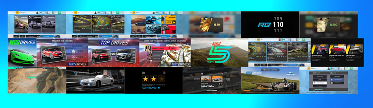
Ideation & Prototype Assets
Based on the comments and references above, I explored several approaches to solve each one based on the wireframe provided for the test in order to have an up-to-date and modern interface.
Although I reorganized certain elements, I tried to keep the general layout in order to the current user recognizes the navigation of the current game.
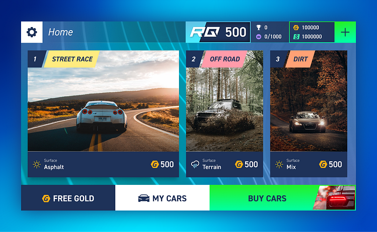
Final Render
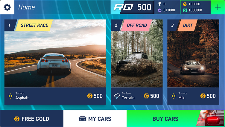
This was the final result after a couple of hours of work in a couple of days. After that I wanted to implement this screen in UE5 but that will be another entry in my portfolio :)
