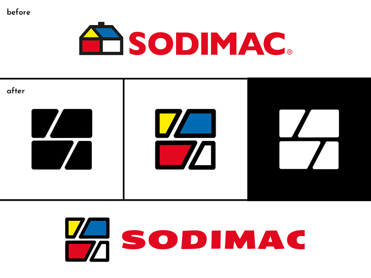
#73 Sodimac
Country: Chile
Industry: commerce
About: Sodimac Homecenter is a chain of home improvement stores founded in 1952 in Santiago, Chile, as a cooperative, in response to the shortages caused by World War II in Chile. Besides Chile, there are stores in Argentina, Colombia, Peru, Mexico, Uruguay, and Brazil.
Purpose: “Together we build dreams and home projects. Simplify and enjoy life more.”
Words: innovation, dreams, home.
Strategy: before getting to the final result, I played with the simple shapes of the triangle and square. My first idea was to create a completely new logoword, but I landed on something more interesting: bricks. The new logomark uses bricks as symbol of home, building, and dreams, as well as including the letter “S” of “Sodimac”. The original colors were maintained, to reflect the Chilean identity of the brand, while the rest of the logoword was refreshed with a more modern typeface.