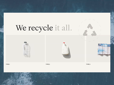
Motion Design for the Recycling Company🔊
What's up! We are continuing to talk and share insights about the Brightmark project.
Zajno was in charge of creating and developing the 'How It works' section. We wanted to make sure it breaks down the recycling process in a clear and concise way. It's easy on the eyes and makes navigating the website a breeze.
But let's talk about animation for a second. The goal was to add an extra layer of engagement to the website. So, the animation took it to the next level and made the whole experience of learning about the recycling process interactive and fun.
Go ahead, check it out, let me know what you think in the comments, and stay tuned for more.
Website | Codepen | Behance | Twitter | Facebook | Instagram
More by Zajno View profile
Like
