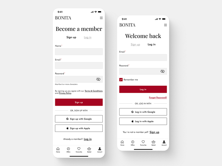
E-commerce app - Sign up and Log in
Hello Dribbble community!
Today I would like to share with you the Sign up and the Log in screen of my E-commerce mobile app designed for iOS.
Learn how to design these forms with my screens along with my user experience explanation. Also, we have to keep in mind the company's needs so we need to focus on the conversion rate optimization too. I hope you'll find it useful!
UX explanation:
on the sign up screen the button with the label "Log in" is clearly visible for those who have an account,
on the login screen the button with the label "Sign up" is clearly visible for those who want to create an account,
required fields are marked with the red indicator,
the eye icon in the password field helps with a potential error when filling in the field,
the text with the label "By signing up you agree with our Terms & Conditions and Privacy policy" is clearly shown as an underlined and clickable link,
the checkbox is big enough to click on it and also text near this checkbox is clickable,
buttons "Sign up" and "Log in" are visible, and readable and have a label that indicates what is going to happen,
the button with the label "Forgot password?" is clearly visible and indicates what is going to happen,
there is an option to sign up or login faster with social accounts.
Conversion rate optimization:
top aligned labels help users to fill in forms faster and to move down the form in one visual direction (this allows the users to complete the form first try),
main CTA buttons "Sign up" and "Log in" are clearly labeled and have a high contrast (no potential drop-off point here).
Let me know your thoughts on that. Your feedback and appreciation are always welcome.
Thanks a lot :)
Mirka
