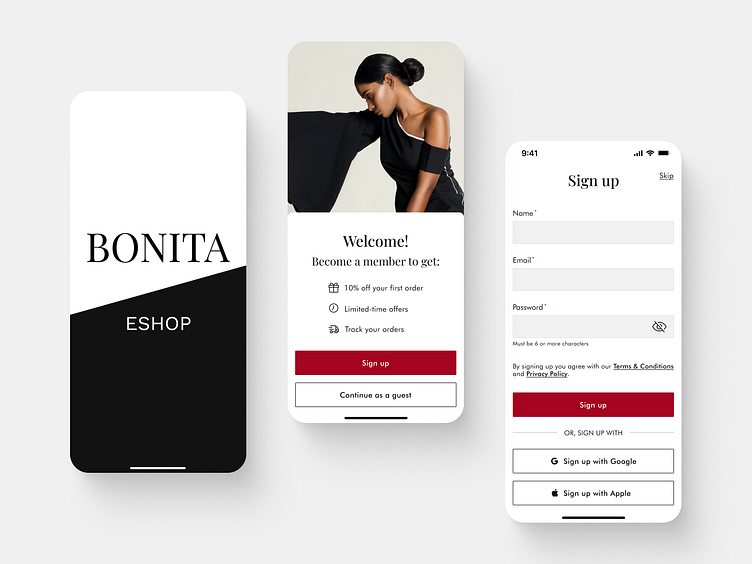
E-commerce app - Onboarding
Hello Dribbble community!
I would like to share with you my Onboarding screens for an E-commerce mobile app designed for iOS.
Learn how to design onboarding screens with my designs along with my user experience explanation. Also, we have to keep in mind the company's needs so we need to focus on the conversion rate optimization too. I hope you'll find it useful!
UX explanation:
the button with the label "Sign up" is clearly visible, readable and have a label that indicates what is going to happen,
the button with the label "Continue as a guest" is clearly visible and is giving an option to users to go straight to the app,
the benefits of signing up are clearly visible along with icons for faster scanning,
required fields are marked with the red indicator,
the eye icon in the password field helps with a potential error when filling in the field,
the text under the password field indicates how many characters are required to correctly fill in the field,
the text with the label "By signing up you agree with our Terms & Conditions and Privacy policy" is clearly shown as an underlined and clickable link,
there is an option to sign up faster with social accounts.
Conversion rate optimization:
main CTA buttons "Sign up" and "Continue as a guest" are clearly labeled and have a high contrast (no potential drop-off point here),
top aligned labels help users to fill in forms faster and to move down the form in one visual direction (this allows the users to complete the form first try),
social media help users to sign up much faster (it increases conversion).
Let me know your thoughts. Your feedback and appreciation are always welcome.
Thanks a lot :)
Mirka
