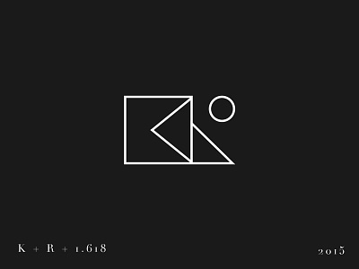
The Logo :)
Hi guys!
I present to you my logo which I've designed couple of weeks ago. It was all about the "K + R" monogram from the very beginning. It was a priority for me to make this shape as geometric as possible. I went through many various combinations of linear shape. For the core construction I used the golden ratio which appearance is all arround in the nature - it always makes the design solid and stellar. Finaly, I decided that my logo is ready to show it to the World .... so here it is.
Please leave your comment and of course follow my activity on profiles linked below.
Enjoy whatever is left of this day!
More by Karol Rycio View profile
Like


