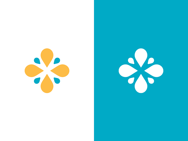
Kid's Program Logo
A mark for a youth program that is part of a larger ministry organization. The marks for the other parts of the organization all incorporate the droplet shape so I utilized that here to stay consistent with the brand, while working to define this mark as it's own with bright colors and a unique shape that is reminiscent of the cross.
More by MilesHerndon View profile
Like
