Kindle UI Redesign
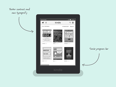
I don't know how much you use your Kindle, but I use mine every day, and the UI isn't fantastic. Just for fun I decided to give my self a creative challenge and redesign the Kindle UI.
To improve it, I cleaned up unnecessary buttons and used more shades of gray to give the navigation and the content more contrast and depth.
I also changed the typeface to Gotham, which I think works much better for an UI like this.
If you want the Kindle mockup, you can download the sketch file here: https://www.dropbox.com/s/hz5ab91zh8oa11p/Kindle_mockup.sketch?dl=0
More by Kalle Moen View profile
Like


