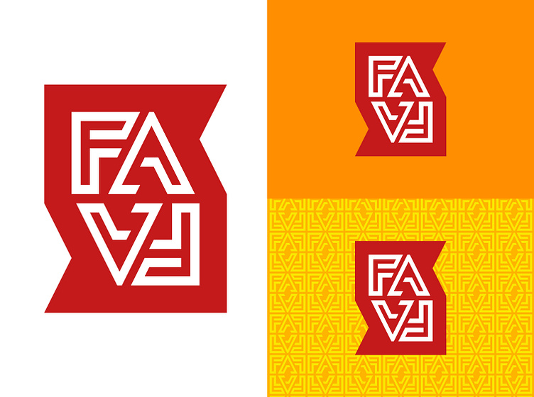
FAFA (From Africa For Africa) Logo Design
FAFA, with its repeating letters, was ideal to play with in a more creative way. Part of the inspiration for the brand was West African fabrics, particularly a Nigerian indigo print technique that used detailed line work tone on tone. This line work became the format for creating bespoke type for FAFA. The use of repeated positive and negative spaces created a sense of pattern which would later form the basis of the brand's visual identity.
A strong holding shape, based on the stacked letterforms, was created for ease of use on multiple backgrounds. Symrise Red was used as the holding shape colour to bring in the parent brand in a consistent way.
More by Beverley Glanville View profile
Like
