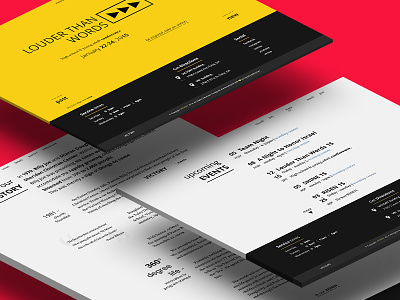
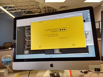
Victory — Redesign Project
Hello again!
I wanted to showcase my little-big project I've been working on for over a year. I've spent around 115~ hours on design, and ~20 hours coding this thing up, still in progress :)
The overall idea is to be non-standard, yet simple, understandable, minimal, big, memorable. The problem with the original design was that Navigational structure. I decided to simplify it by showing only 3 main pages that I'd be interested in for the first time, and hide everything complex under a minimap.
But if you go deeper into the menu tree, you can find yourself tired of always opening the menu and following the next-in-line link. That why I used contextual menu, or a breadcrumbs navigation.
I've build the layout by following principle of left-to-right and up-to-down motion (South-East). Most of us tend to read left-to-right. And if we tend to read that way, we also tend to view websites that way, we read them. Left side is for important information, something that I should know right away, and the right side is for those who look deeper and to the end (end of the line or a page).
The lack of images is, by the opinion of some people is the biggest problem. But I don’t want to touch it yet, I wan’t to make typography right first.
I chose two different font families: Open Sans for headlines and Information, Volkorn for giant blocks of text and supportive information.
So my questions to you my fellow dribbblers, have I reached my goal, or am I at least in the right direction? I would love any piece of your opinion, whether it's hate or love. Or maybe a friendly advice :)
Original website: victory.com
I've rebounded with better shot preview. Wonder if that has anything to do with views and likes :)
Thank you!


