Sacha Kato's Blog || Personal Blog UI Concept📚

Hello and thank you for clicking! ✌
I'm excited to share my own exploration of a realization of a personal blog web page. Me, being a huge fan of such pages, have always found them quite poorly designed and organized.
Here're main problems of such sites that I've been conserned with:
Poor visual design, that repulses first time visitors and doesn't make them stay on a page, no matter how good of a quality the content is;
Poor content organization and confusing ways of finding information: the webpages are usually cluttered with various sections, tags, ads, comments, etc. -- everything but the information I want to find;
Unclear ways of accessing the older content: often times authors make archives with quite a confusing organization, which, as well, makes it harder to explore the whole range of content author provides;
Lack of personality: the whole point of personal blogs lies within the fact that they are personal and written by a unique human being. The branding side of personal blogs (esp. in the field of authors who are working in academic structures) is often times falls a victim to the convenient typical templates.
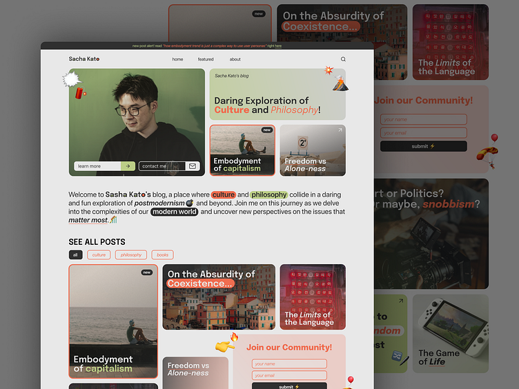
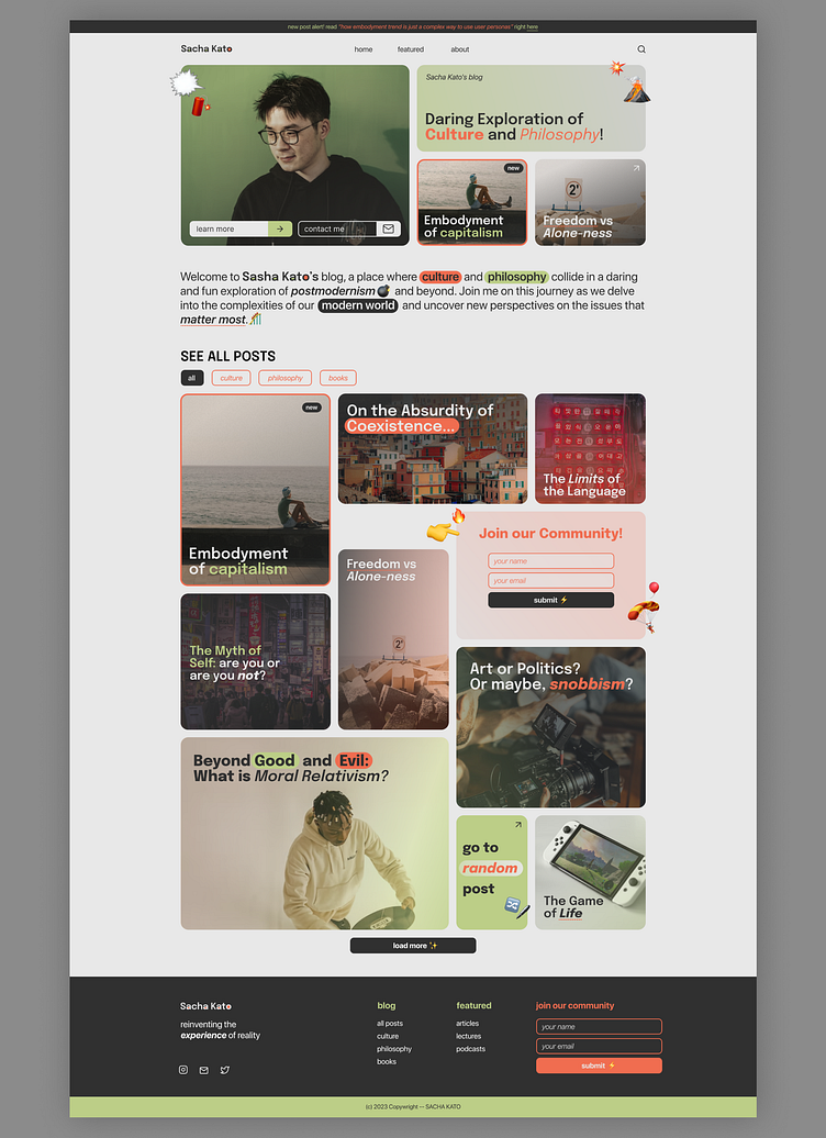
That is why I've come up with the character of Sacha Kato, who is a life-long student, interested in social sciences and unusual ways of interpreting their findings. I've set a task to design a blog that would both easy in terms of navigating content, as well as communicating Sacha's personal brand through the visuals.
🤓To solve this, I implemented several things:
A block layout as a way of presenting content. This solves:
(a) displaying content in a straightforward way, making it obvious that the key task of this webpage is its articles and blog posts;
(b) filling up the visual space and making the maximum out of the space one can use on a page, without cluttering it with an outdated section-based layout templates;
A clear and consise hero-section, which communicates the personality of the author (and, therefore, of the content) both verbally and visually;
Random post button: the posts are ordered in a chronological order within an infinite block layout, which can make it dreadful for a user to scroll through miriads of posts to reach older content. To solve this issue I've implemented a little interaction which throws a user to a random older post, so that:
(a) a user can explore older posts and posts that are not of something he would usually click on without scrolling far down;
(b) it's a fun way to introduce new blog visitors to the blog's content;
(c) solve a problem of choice paralysis -- the randomizer makes a choice for a user what they should read.
Reduction of site sections' number: usually in many blog websites there're lots of various unnecessary sections that are not only confusing, but also clutter the webpage and make it harder to find and access the searched information. That is why the organization of the webpage is divided into 2 big sections:
(a) the navigation of the webpage as a whole, which is presented in the upper nav bar menu and divided into 3 sections: home (all of the content), about (a more thorough presentation of the blog's author) and contact
(b) the navigation of the content: it is presented with the use of tags, which can be activated and searched by. All of the tags can be found on the very top of the infinite block layout section (under the heading "SEE ALL POSTS"), as well as in the footer
Thanks for scrolling ♡(>ᴗ•)
Don't forget to 💗 and follow me :)
I am open for new projects! Contact me through:
📧email: sofyavibe@gmail.com
✈telegram: @sofyavibe