News Website Design Concept
💌 Have a website idea? Let's make it together!
hello@ronasit.com | Telegram | WhatsApp | Website
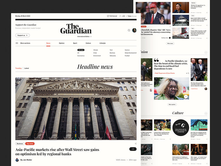
Our team has recently created the redesign for the Guardian new website. In the process, we tried to stay consistent with the Guardian’s visual style and add a few fresh touches. The new design features a main page with an overview of the latest news, including a menu, the latest articles, and a selection of news categories to choose from.
One of the key benefits of this new design is its easy navigation and neat layout, making it a convenient source for keeping up-to-date with the latest news.
The color palette for the redesign is a striking contrast of black and light cream, reminiscent of paper, with accents of bold red-orange. This creates a stylish and modern take on the traditional print newspaper format.


