Ocean Yoga Kenting
Ocean Yoga is a boutique yoga studio located in Kenting, Taiwan
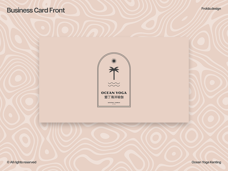
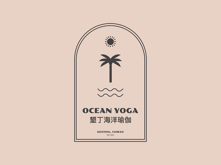
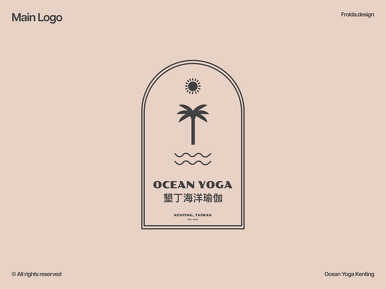
The requirement for the logo is to be simple, memorable but sophisticated at the same time. I have created a boho-style logo showcasing the tropical feel of the studio and the area the studio is located in
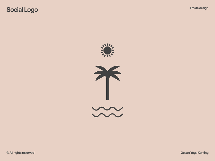
I have also created a social logo with only the internal elements shown (palm tree, sun, waves) to help with quick and easy recognition even when the image is small
Colour palette
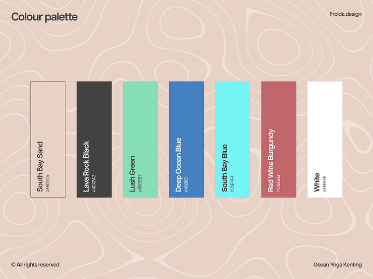
The colour palette is inspired by the landscapes around Kenting, which is a tropical paradise in southern Taiwan, with landscapes similar to Hawai'i
It includes a Sand colour and a Blue that matches the colours of South Bay or Nanwan beach where the studio conducts Beach Yoga sessions
Lush Green, Lava Rock Black and Deep Ocean Blue are colours that you can find in multiple places around the area
And last but not least the Red Wine Burgundy colour was added as another contrasting option that goes really well with the Sand colour, to symbolise the studio's Red Wine Yoga classes.
Typography
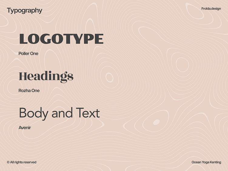
The fonts were chosen to match the brand, with a display font for the logotype, a feminine serif font for headings and a clean, geometric sans serif font for everything else.
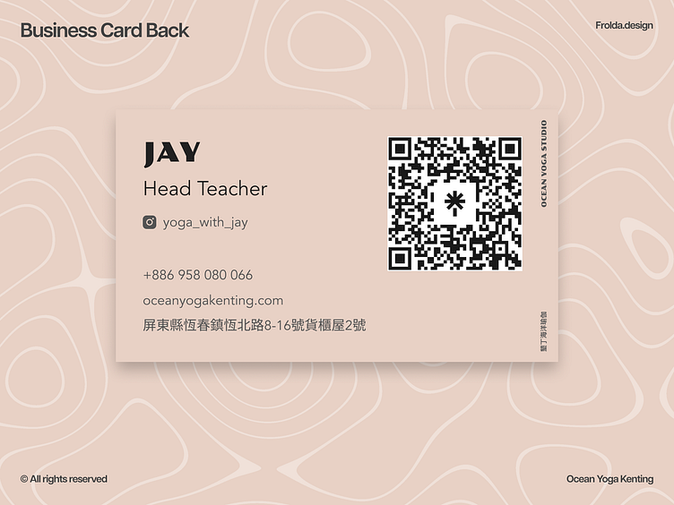
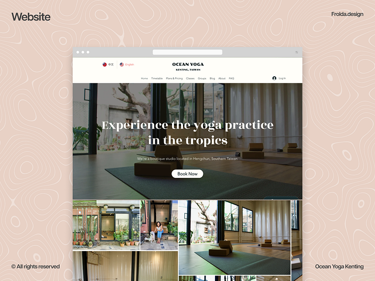
Branded Assets
The branded assets included Print material, decals and a website.