[Work] PAL Learning Website Redesign
Project Overview
The project was to redesign the PAL Learning website.
Pain Points
I decided to tackle the four pain points that were important to interested parents that visits PAL Learning's sites.
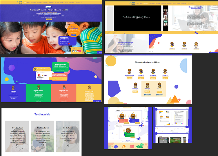
1. Overwhelming information
When the user loads into the homepage, the colours may overstimulate them. The multiple bubbles can also make it hard for user to focus and find the information they need, making it a distraction.
2. Confusing navigation menus
There are too many irrelevant menus in the navigation tab, which distracts the user's attention from the main product they are trying to sell.
3. Slow loading time
Tested with 3 different devices(Windows laptop, PC, phone) at different type of the day, the average loading time to the landing page is 5 seconds, while other pages was 3-4 seconds.
4. Lack of clear next steps to address user questions or problems
Tested with 3 different devices(Windows laptop, PC, phone) at different type of the day, the average loading time to the landing page is 5 seconds, while other pages was 3-4 seconds.
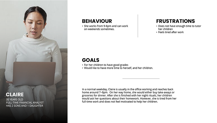
Persona
To redesign the new PAL Learning site, I first created a provisional persona of a potential user based on online research and my understanding of local Singaporean parents. This persona was created with assumptions and surveys to guide my design decisions and priorities.
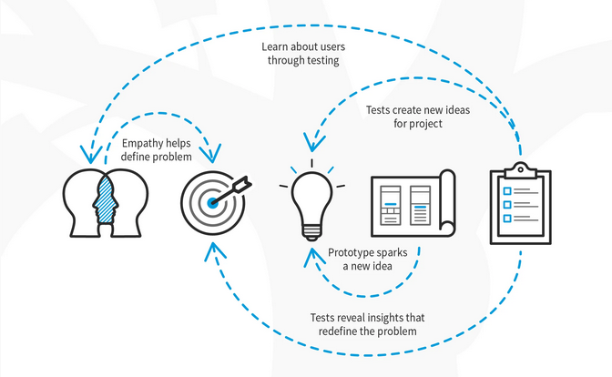
Low-fidelity prototype and usability findings
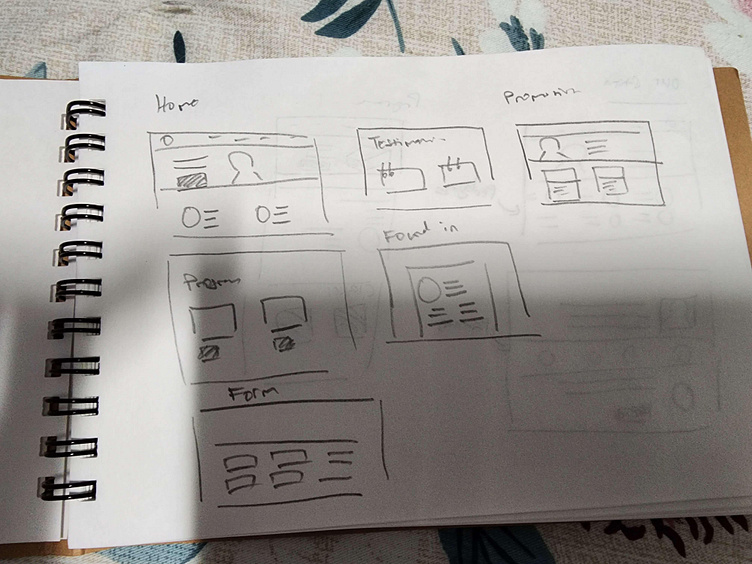
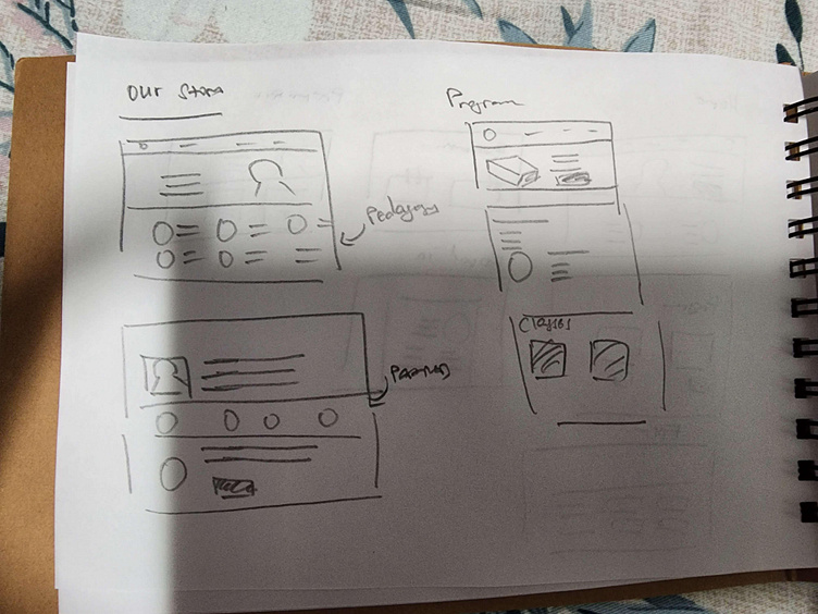
Since this was a redesign, I had all the information I needed in the old site and what they would roughly look like. I created a very simple low-fidelity prototype in my notebook and played around with the placement of each information and worked with the Head of Marketing and Curriculum for the important points they want to highlight.
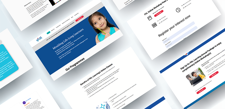
High-fidelity prototype
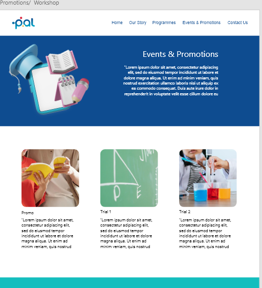
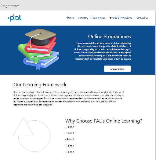
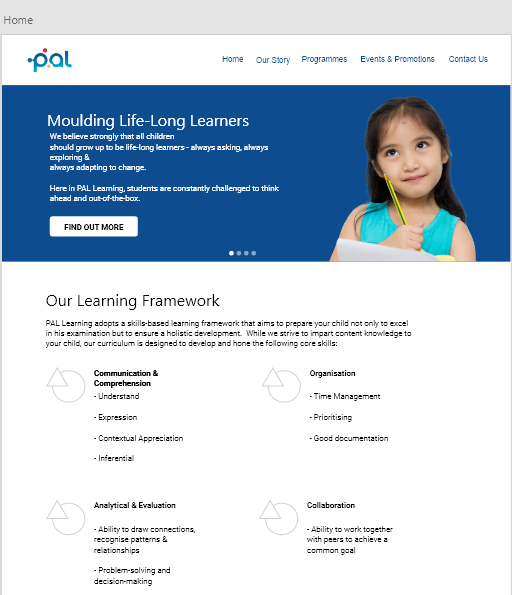
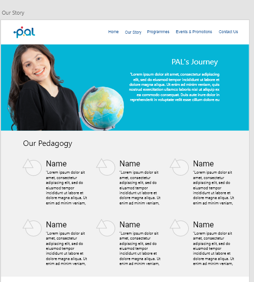
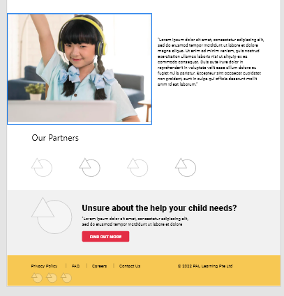
After several discussions, I created the hi-fi prototype in Adobe XD to visualise how the site would look. Our customers can range from mid 20s to late 40s, so I wanted the site to have a clean look with easy navigation.
Accessibility considerations
I wanted the site to have a clean look, where users would not feel overwhelmed at first sight and is able to navigate easily. There is very little animations, except on buttons that I wish to highlight. The design is also easily translated into mobile and tablet view.
